CRAFT / DIGITAL / IDENTITY / MERCH / PRINT
NØGENVIN
"Nøgen" means naked in Danish – a fair name for a range of clean, unfiltered wines, and an excuse for an equally unfiltered tone.
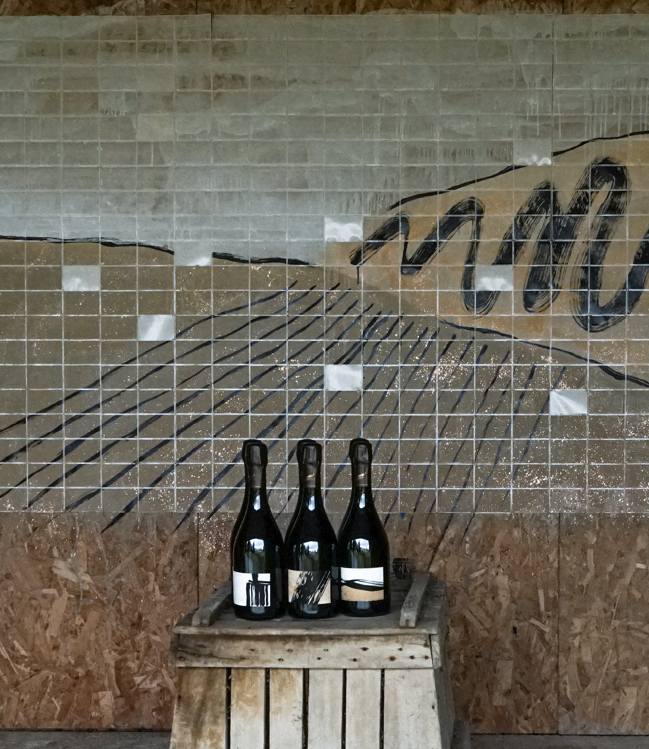
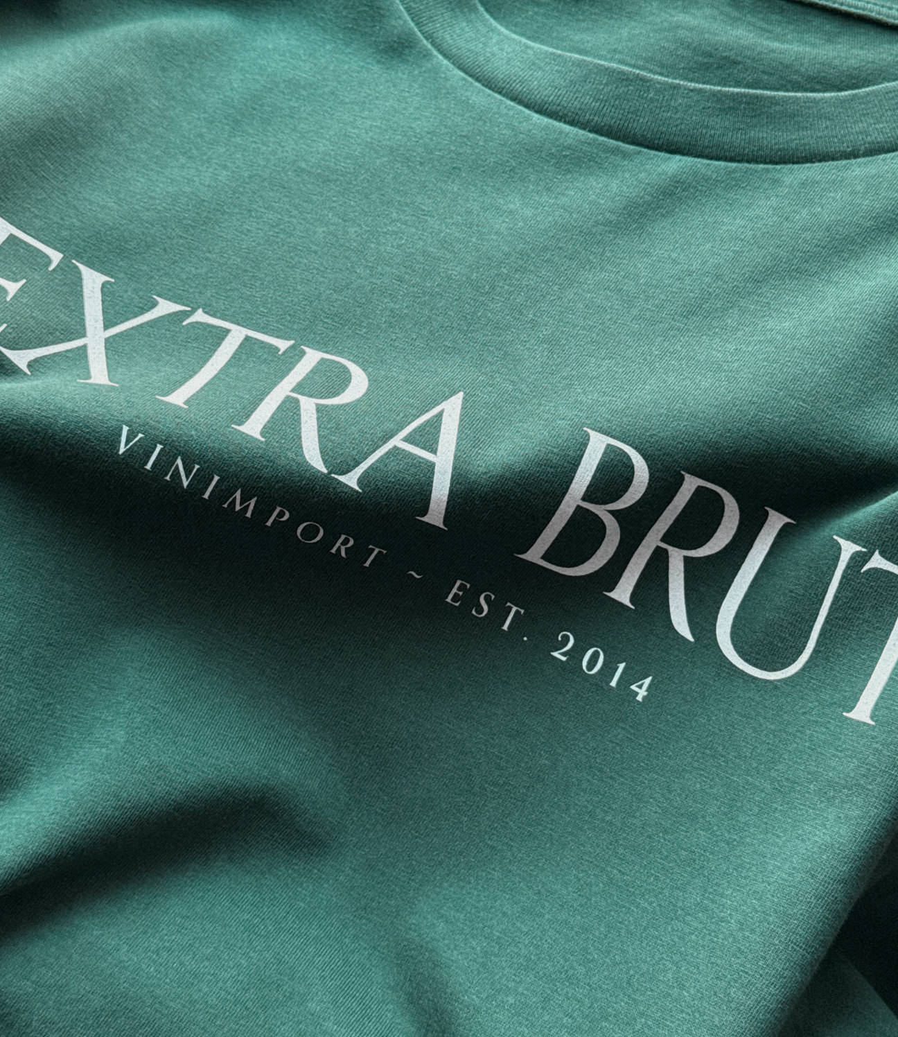
NØGENVIN is a wine subscription built around curated wines made without pesticides – biodynamic, organic and natural. It's close to Extra Brut Vinimport, but the tone is different: more direct, more playful, a bit cheeky, like the wines and the way they're sold.
The visual base stays structured and recognisable – the same deep green as Extra Brut – but we paired it with a soft pink. It's a disarming choice on purpose: it plays on the name without letting things get too earnest.
The logotype is softer, a little naive, with a rounded symbol that nods to "nakedness" lightly rather than literally. In motion it loosens up – small animations give it some rhythm and character. The website keeps the same balance: clean and structured underneath, with little animated touches (boxes, symbols, transitions) to keep it moving and informal.
On merch and social, it gets properly unfiltered – the founder wears it, tests it, and fronts it himself. About as naked as the name suggests.