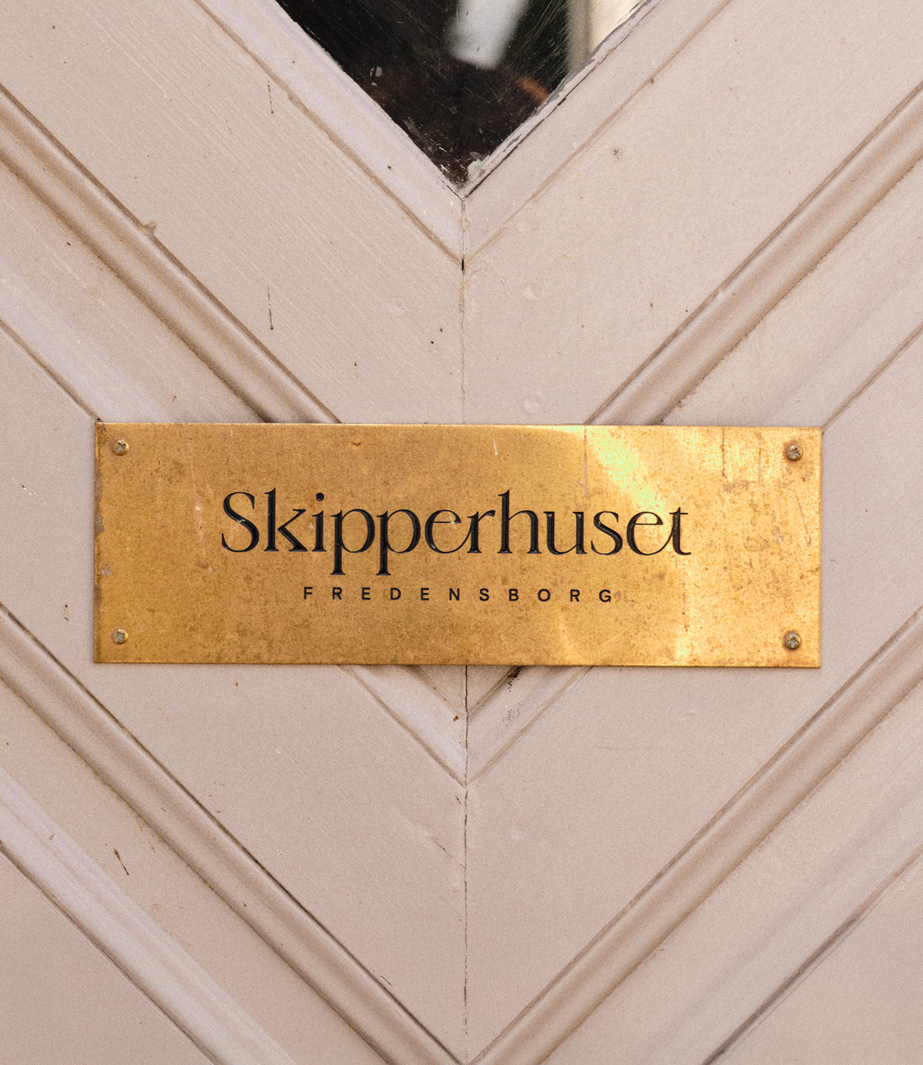
CRAFT / DIGITAL / IDENTITY / PRINT
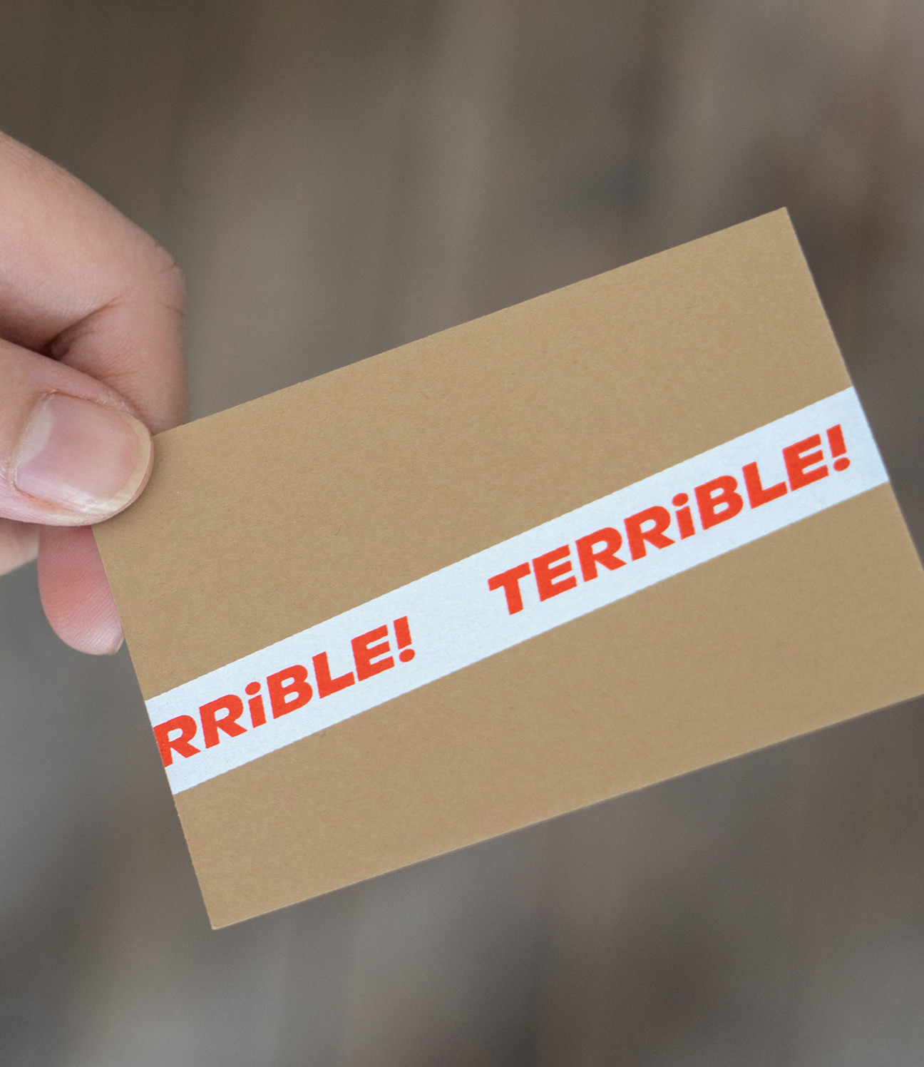
TERRIBLE!
A niche wine company distributing to Paris restaurants. The name is an insult the founder decided to keep.
Terrible! is a wine distribution company dealing in niche champagne and small producers from the Jura, Austria and Croatia, supplied to restaurants across Paris.
The name came from a reaction. Early on, low-intervention wines tended to get a raised eyebrow – "Oh mon dieu… terrible!" So they took the word and kept it, half signature, half provocation.
We built the identity from the language of transport and handling. Bold italic capitals in signal red, mirrored exclamation marks, and a tight palette: cardboard brown, tape white, faded black, red.
Everything is layered like packaging – direct, a bit rough, but on purpose.
The packaging tape came early. We had custom tape made so shipments could be marked straight off, no repacking – a practical thing that ended up being the most recognisable part of the identity.
CREDITS
Designed and crafted by Formgiverne
Technical development by Formgiverne
CLIENT QUOTE

"Bla, bla, bla..."
– Aline & Eric Serva,
Terrible!