DIGITAL / IDENTITY / PRINT
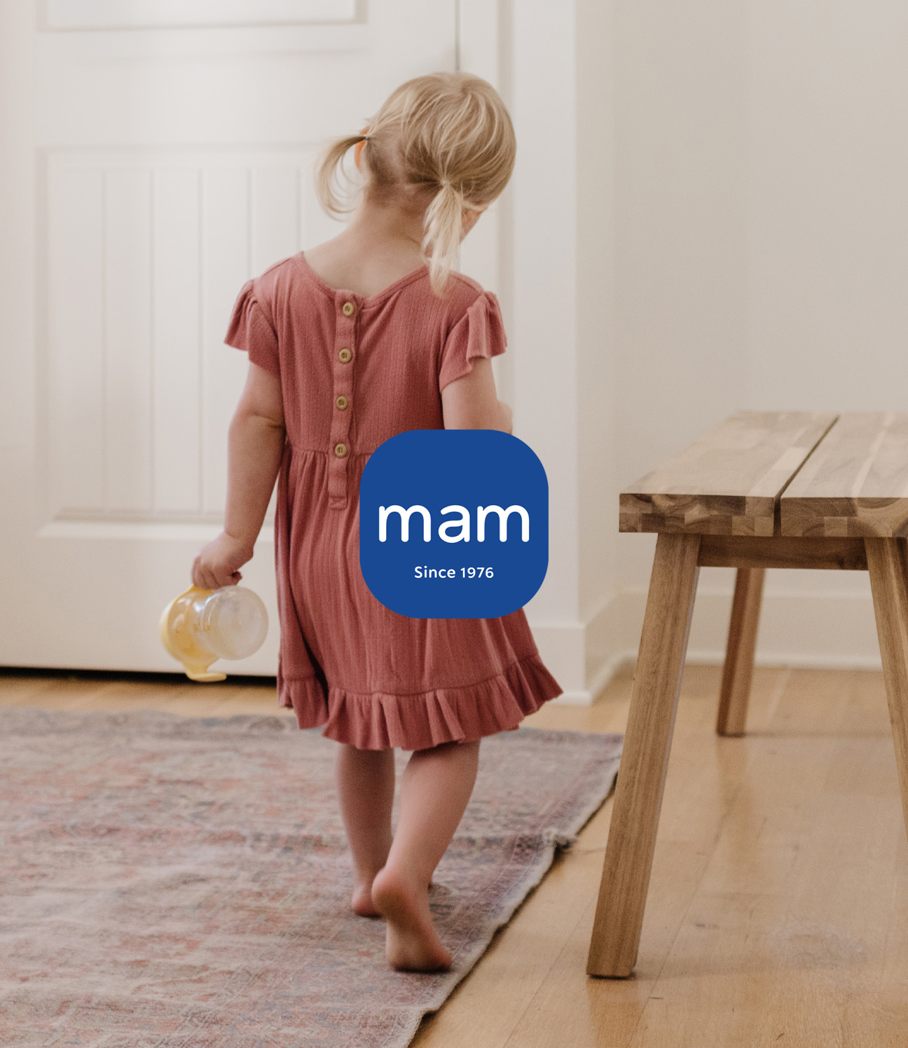
MAM BABYARTIKEL GMBH
A global baby-care brand founded in Vienna in 1976, asked us to design a new website and online shop. What began as a digital brief grew, in close collaboration with the team, into a broader refinement of the brand itself.
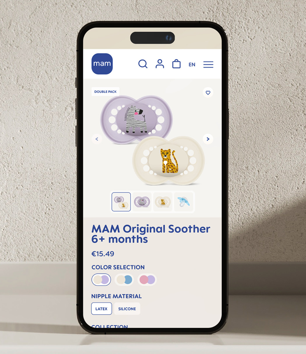
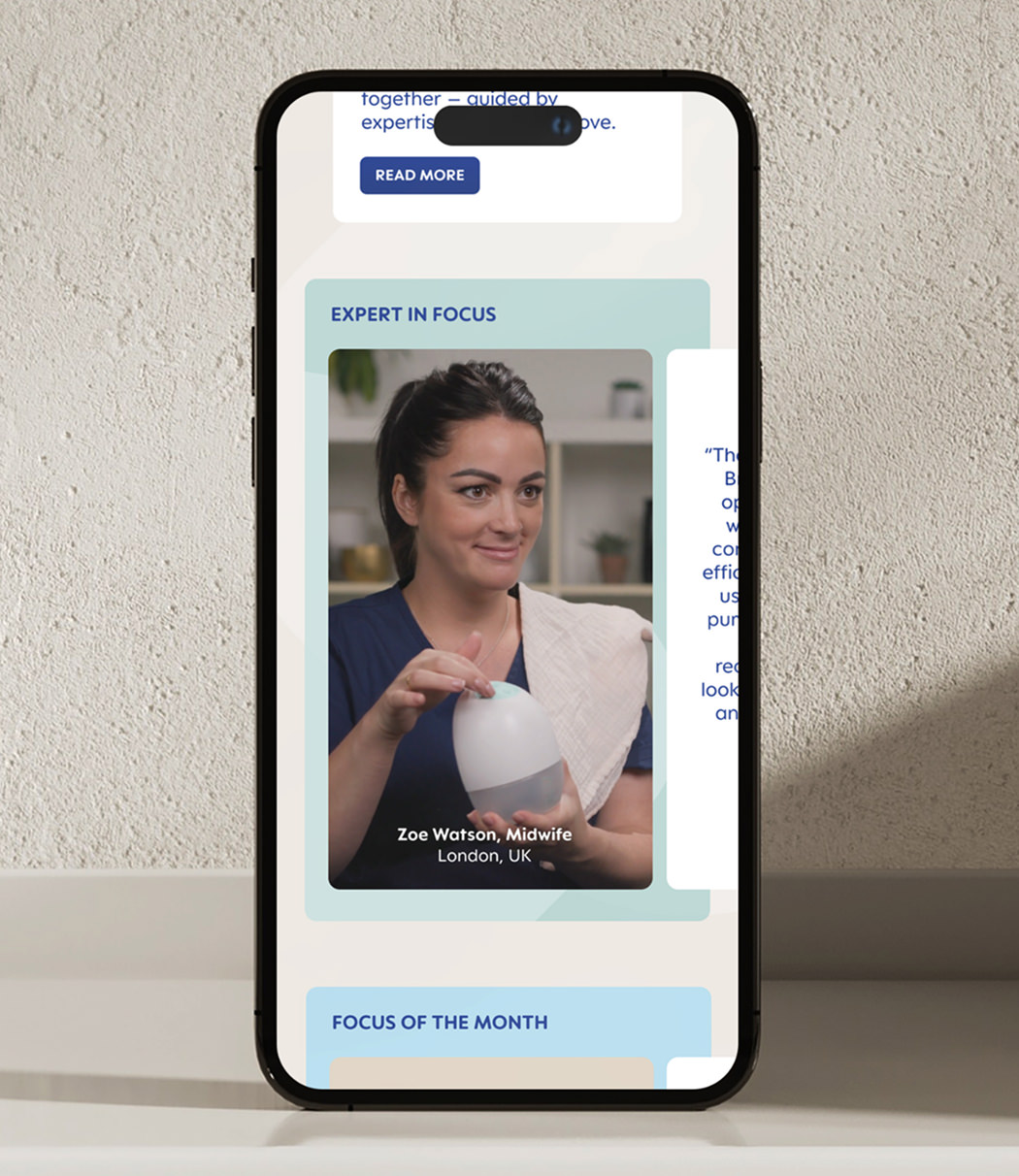
It started with the UX and UI of a new website and shop experience. The focus was clarity: a clear structure, and an intuitive journey from first visit to checkout.
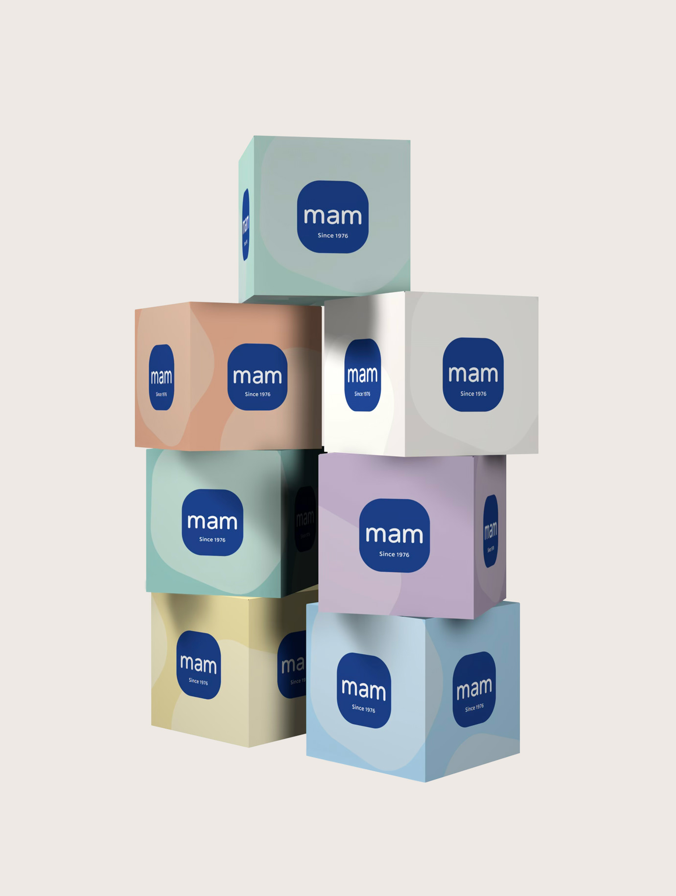
That digital direction became the spark for a comprehensive update of the visual identity, clarifying how the typography is used, refining the colour palette, and setting clearer guidelines around both.
It all came together in a comprehensive brand book, giving teams across markets a single reference to design from.
MAM already had strong foundations so our aim wasn’t to reinvent the wheel. Instead, we focused on clarity and cohesion, ensuring the brand reads as one wherever it appears.
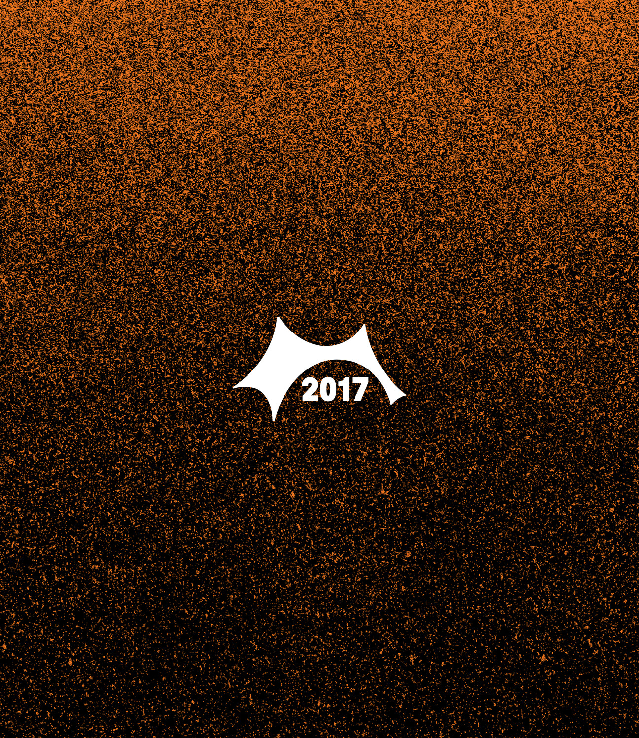
A MARK FOR 50 YEARS
In 2026, MAM turns 50.
We developed a dedicated anniversary mark, anchored in the brand's most recognisable form, but flexible enough to carry messaging about the milestone across global campaigns and in-store. Online and offline, MAM are ready for the next 50 years.
CREDITS
Designed and crafted by Robert Larsen/Formgiverne
Technical development by Moonshiner
CLIENT QUOTE

"Robert combines outstanding UX/UI design expertise with strong business understanding, quickly translating challenges into smart, creative, and user-friendly solutions.
I highly value his proactive mindset, collaborative approach, and the high quality of his work."
– Edith Burghofer-Skorpik,
MAM Babyartikel GMBH