CRAFT / DIGITAL / IDENTITY / PRINT
BOTTI
A small wine bar and shop on Frederiksberg, named after the big Italian barrels wine ages in.
Botti takes its name from the Italian for large wine barrels – a nod to ageing, patience and the slower side of wine. The room is small, and a lot of it comes down to the host: pouring, guiding, setting the tone.
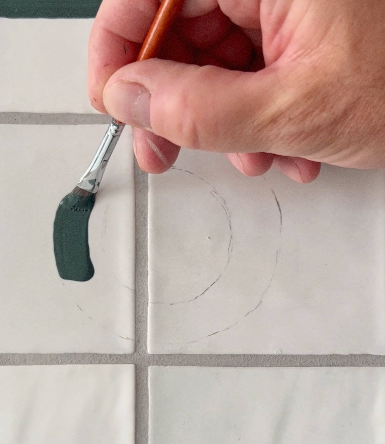
The identity follows that. We drew the logomark by hand, a simplified wine glass and a barrel in one continuous line, so it reads as both at once. In motion it's animated gently, just enough to give it some life on social.
The typography is clean and composed against the softer drawing, with a muted palette – dusty green, warm dark grey, natural white, raw cardboard. It runs across the menus and packaging: quiet pieces that hold the place together without getting in the way.