CRAFT / DIGITAL / IDENTITY / PRINT
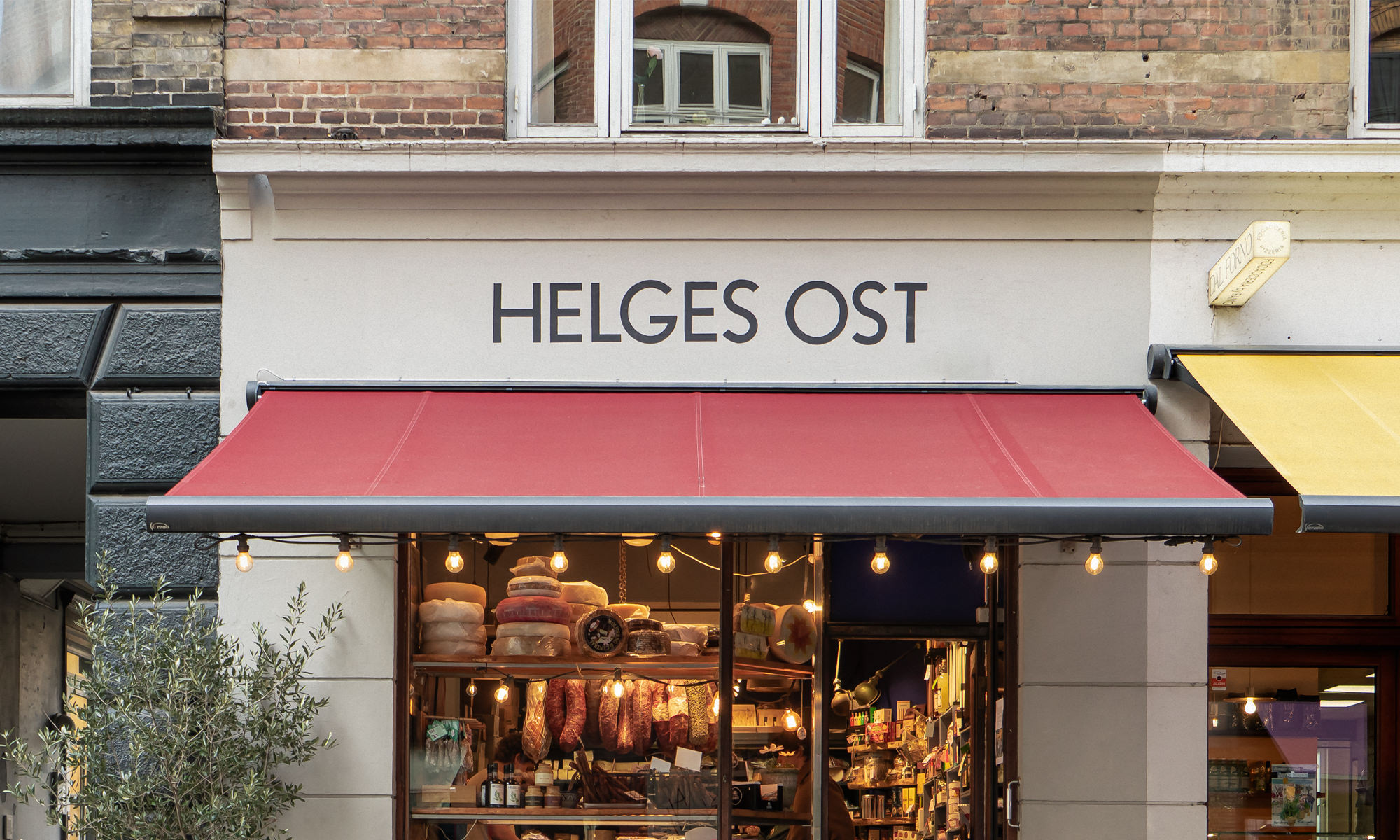
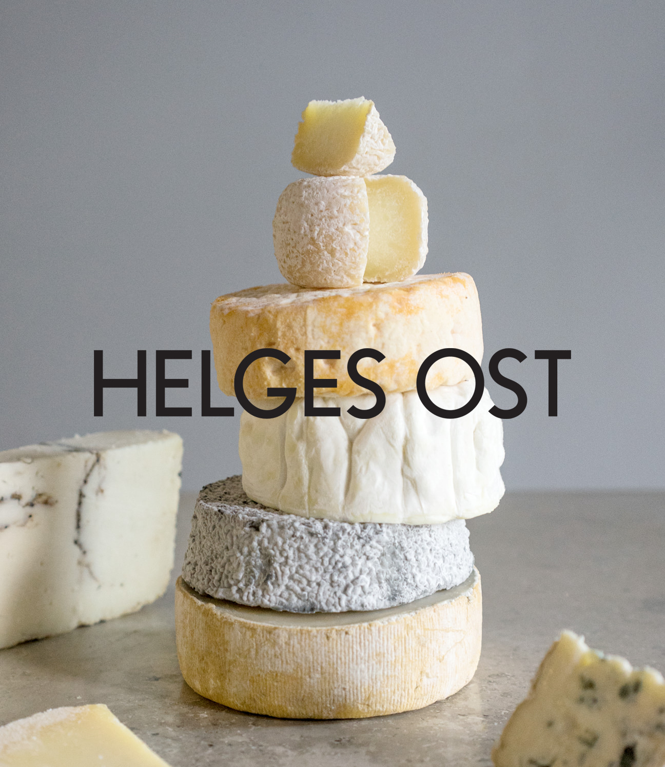
HELGES OST
What started as one small, slightly chaotic cheese shop on Værnedamsvej. Now there's a queue down the street most days.
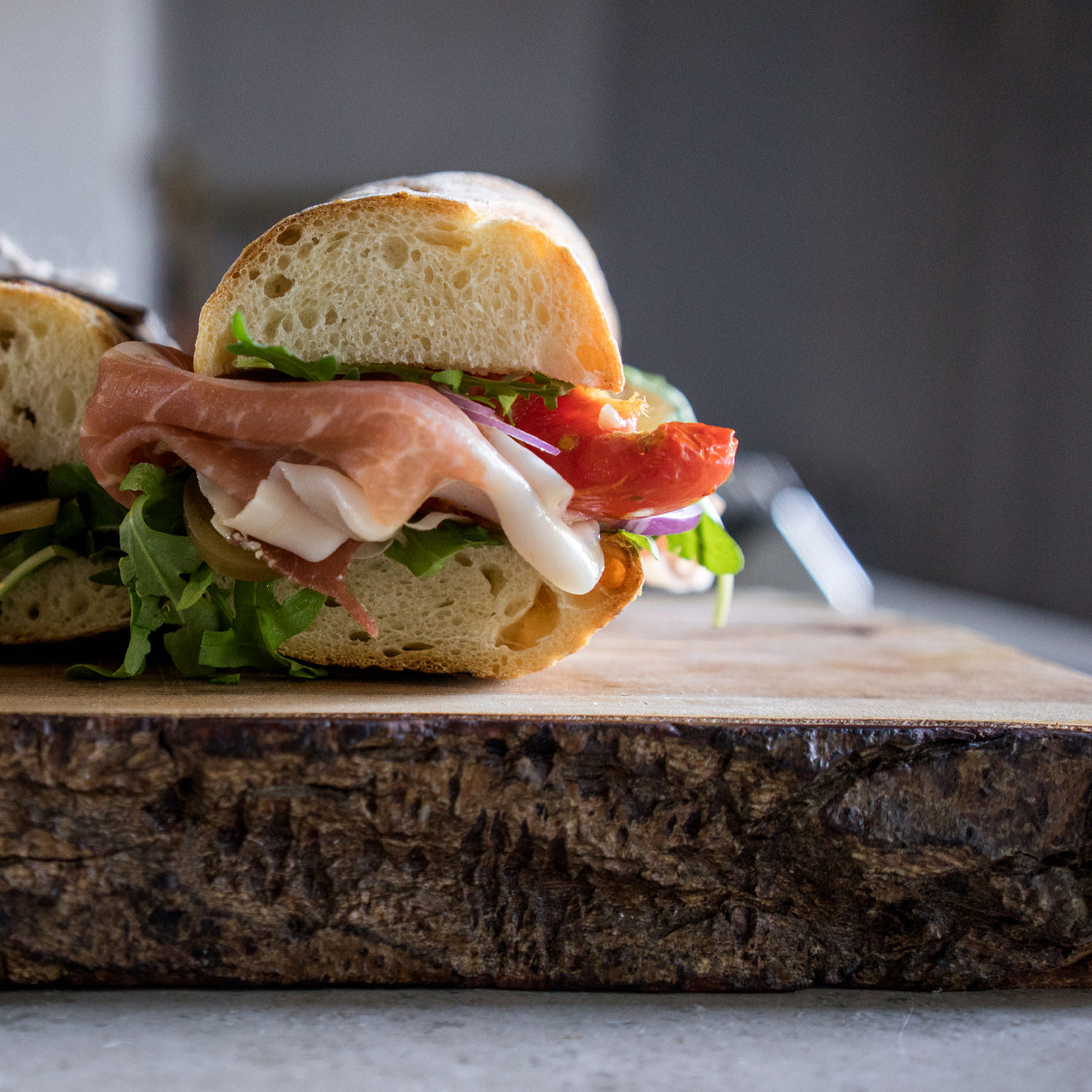
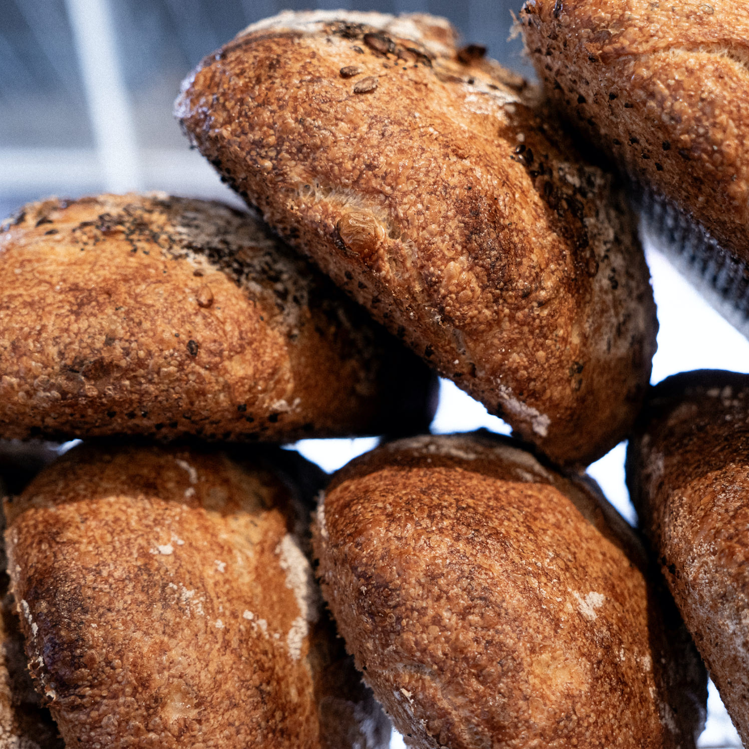
Helges Ost began as a chaotic, charming little cheese shop on Værnedamsvej, run on good ingredients, strong opinions, and a close relationship with both its producers and its regulars. The sandwiches turned it into a destination – the daily lines down the street did the rest.
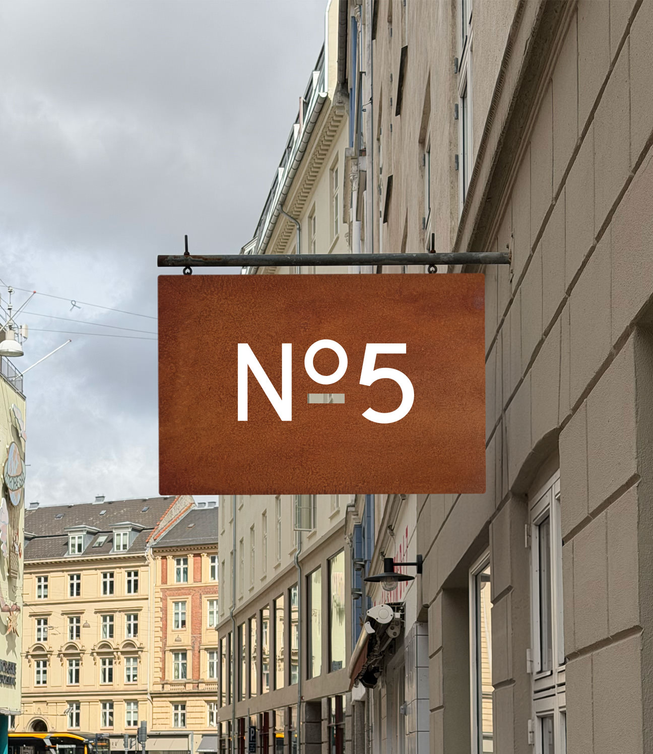
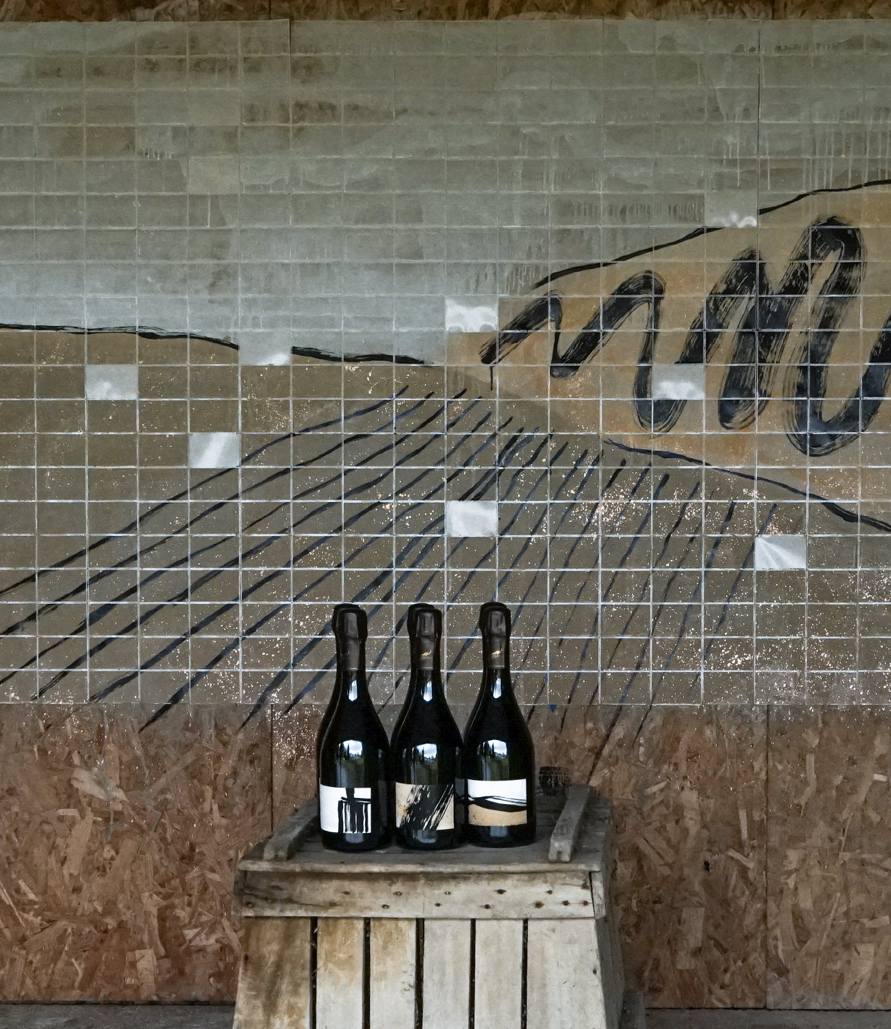
It's still family-run, in the same spirit, and has since added shops in Østerbro and Valby, plus NO 5, a smaller room for tastings and gatherings.
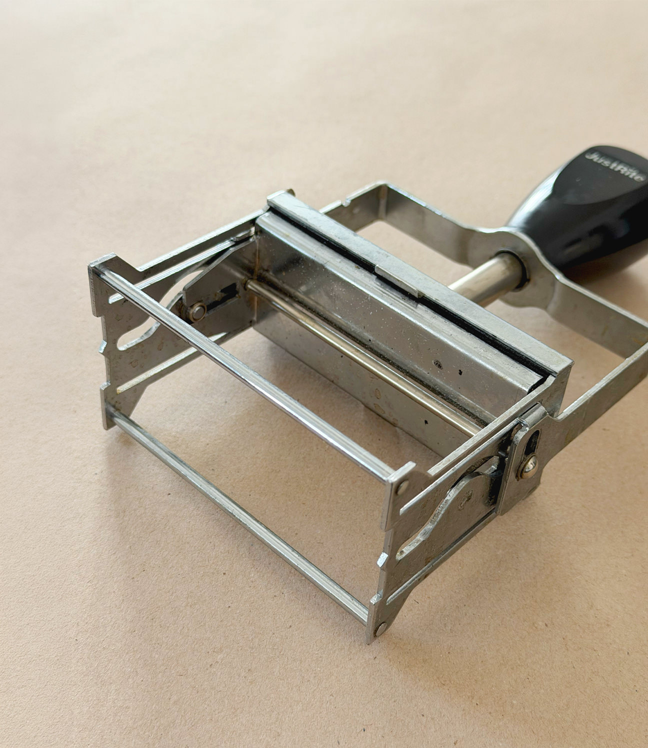
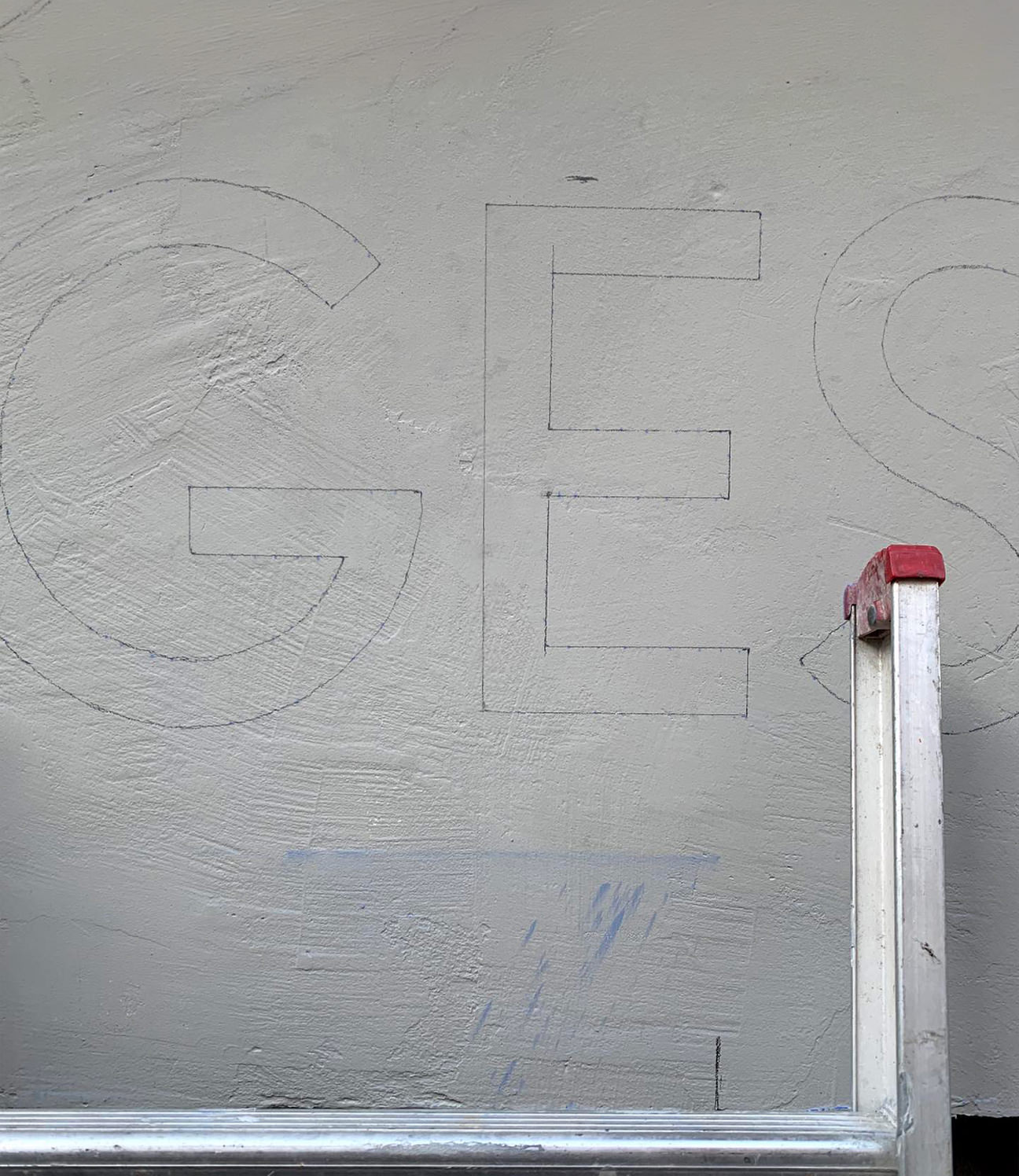
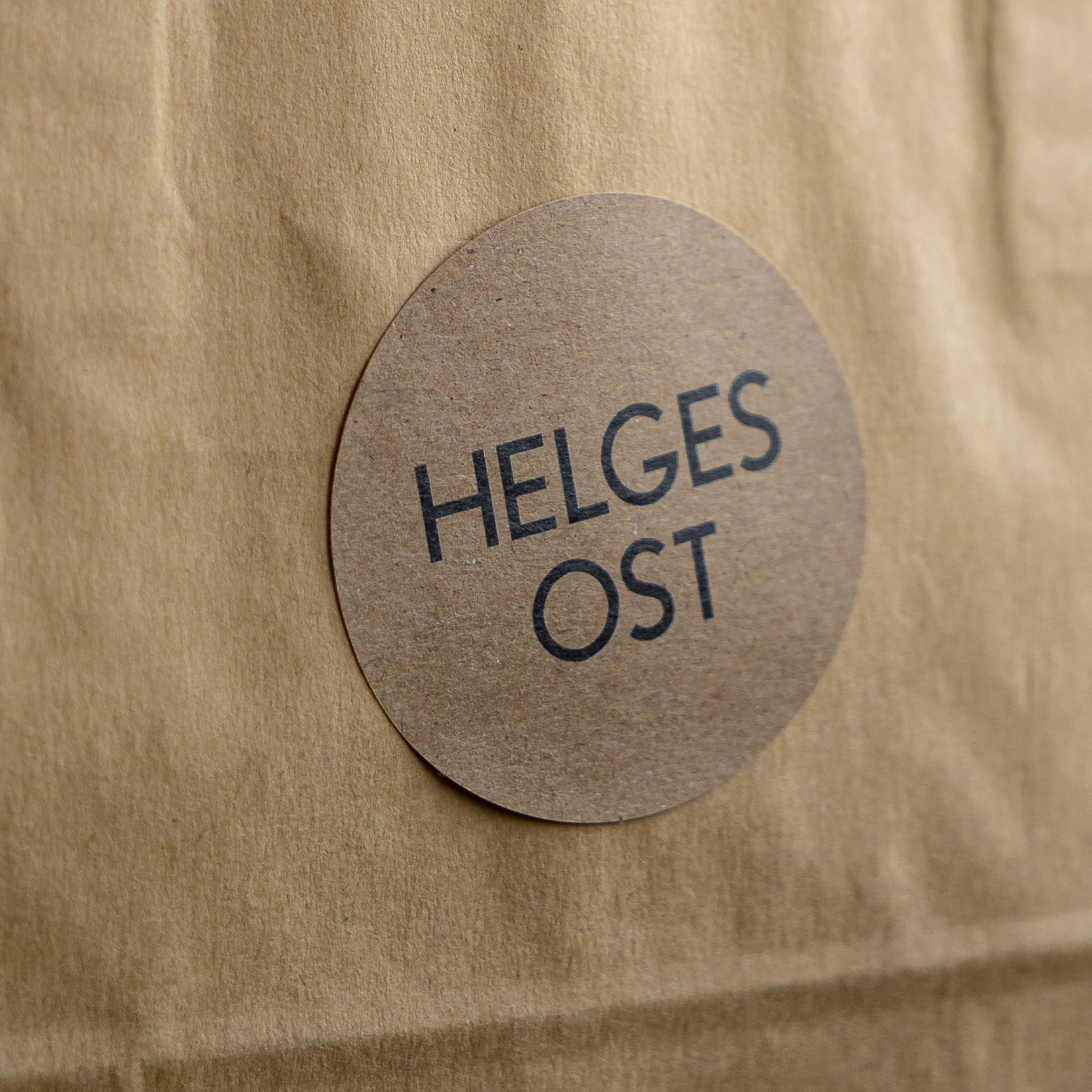
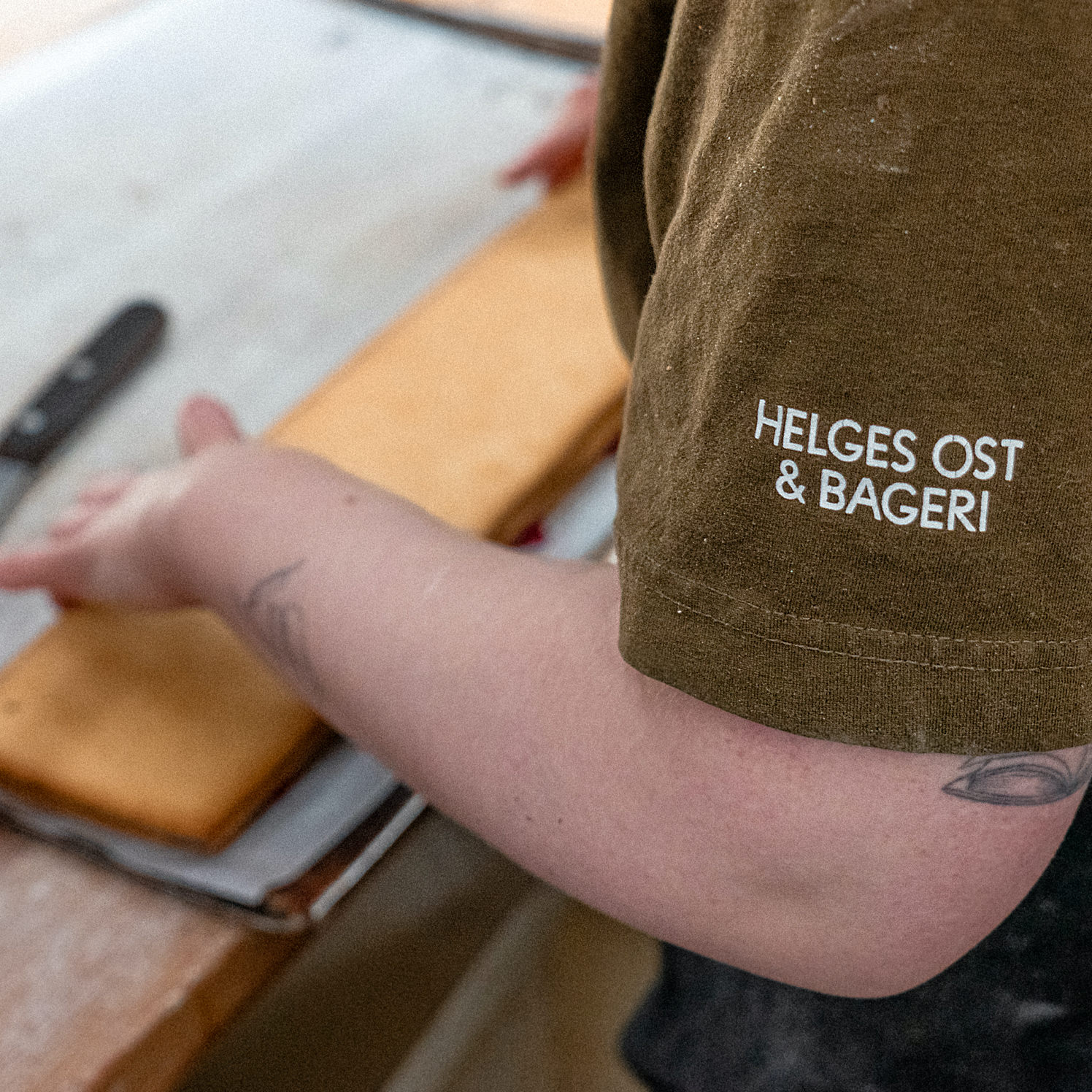
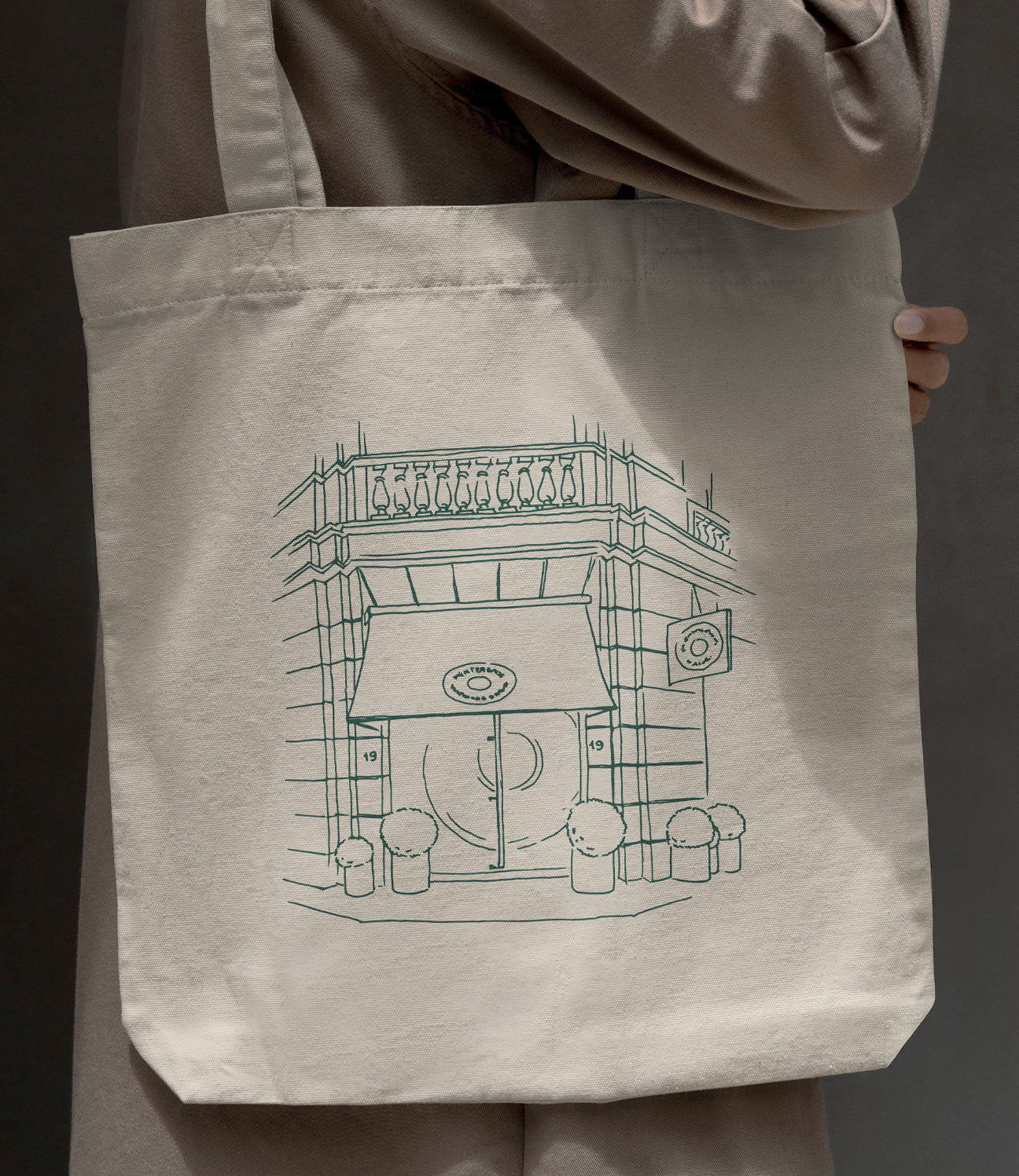
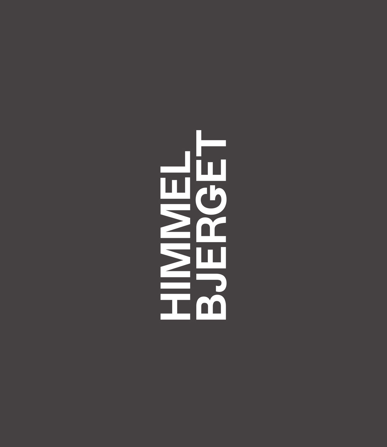
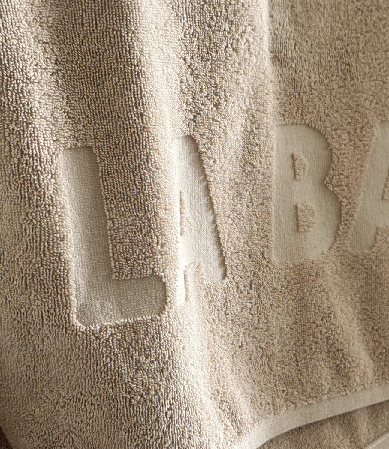
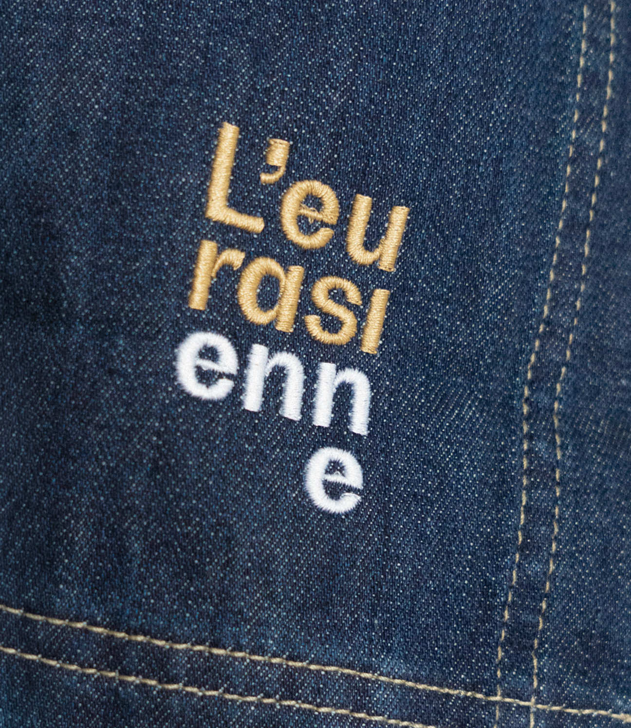
The identity is built from the shop's own history. We reconstructed the original logo from a vintage shop stamp and used it as the basis for a custom typeface, drawn in two versions: a clean all-caps logotype and a looser, hand-drawn one.
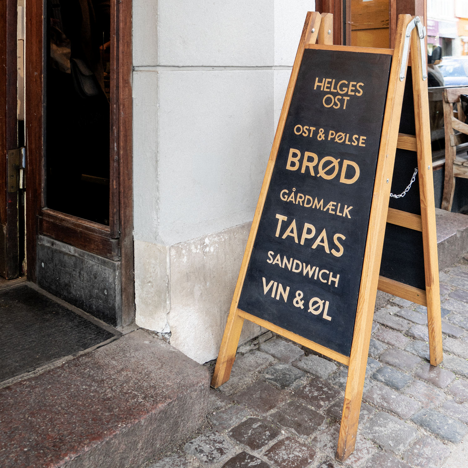
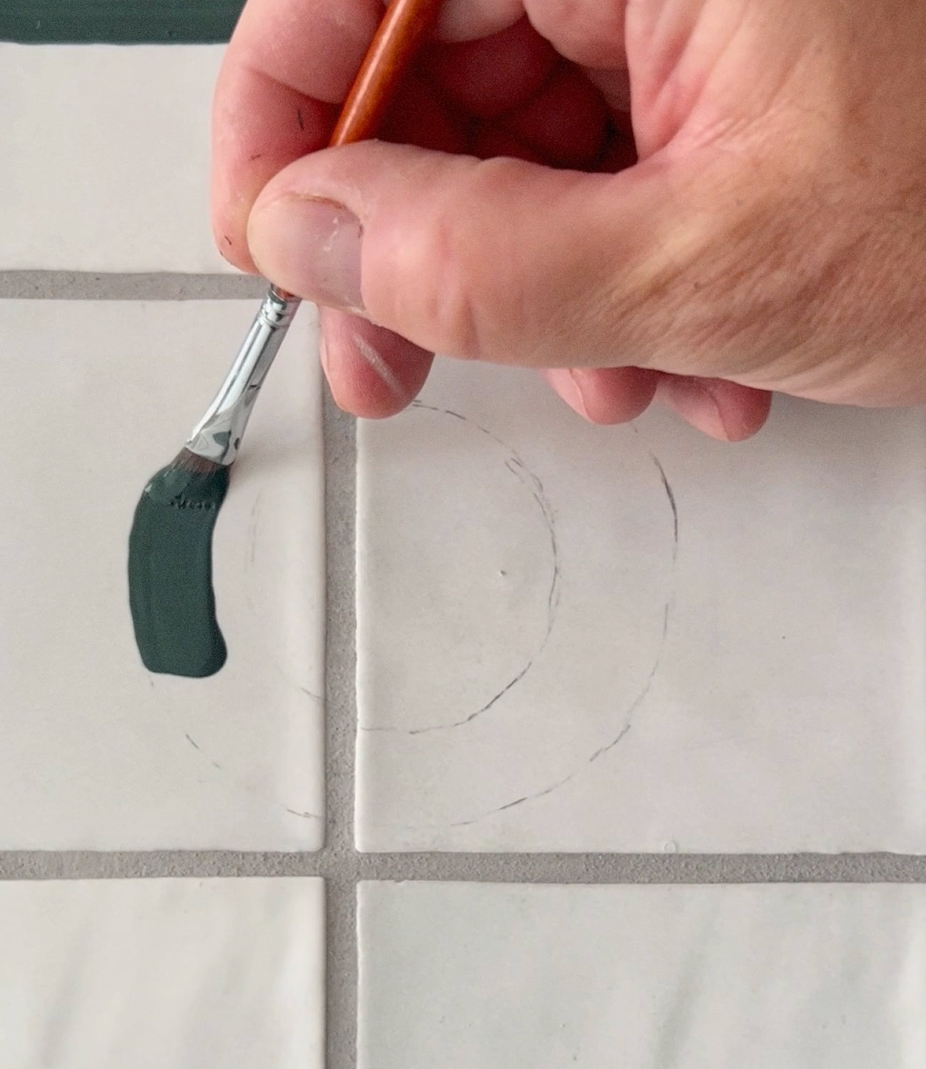
Hand-painting does a lot of the work. The Værnedamsvej facade is painted straight onto the building in a traditional sign-writer's style, with a set of hand-painted A-boards to match. The same hand runs through the print, packaging, photography and website – always a little imperfect, always on purpose.
BUILT BY PEOPLE
This one is more ongoing than most. We keep working with Helges as the shop grows – new signs, new locations, new packaging – staying as hands-on, and as comfortable with the rough edges, as the place has always been.
CREDITS
Designed and crafted by Formgiverne
Photography by Formgiverne
CLIENT QUOTE

"Working with Cecilie and Robert has always felt like a natural extension of how we do things – personal, local, and with real care. They've shaped everything from our logo to our packaging, and it still feels as genuine as the day we started."
– Keenie Green, Helges Ost