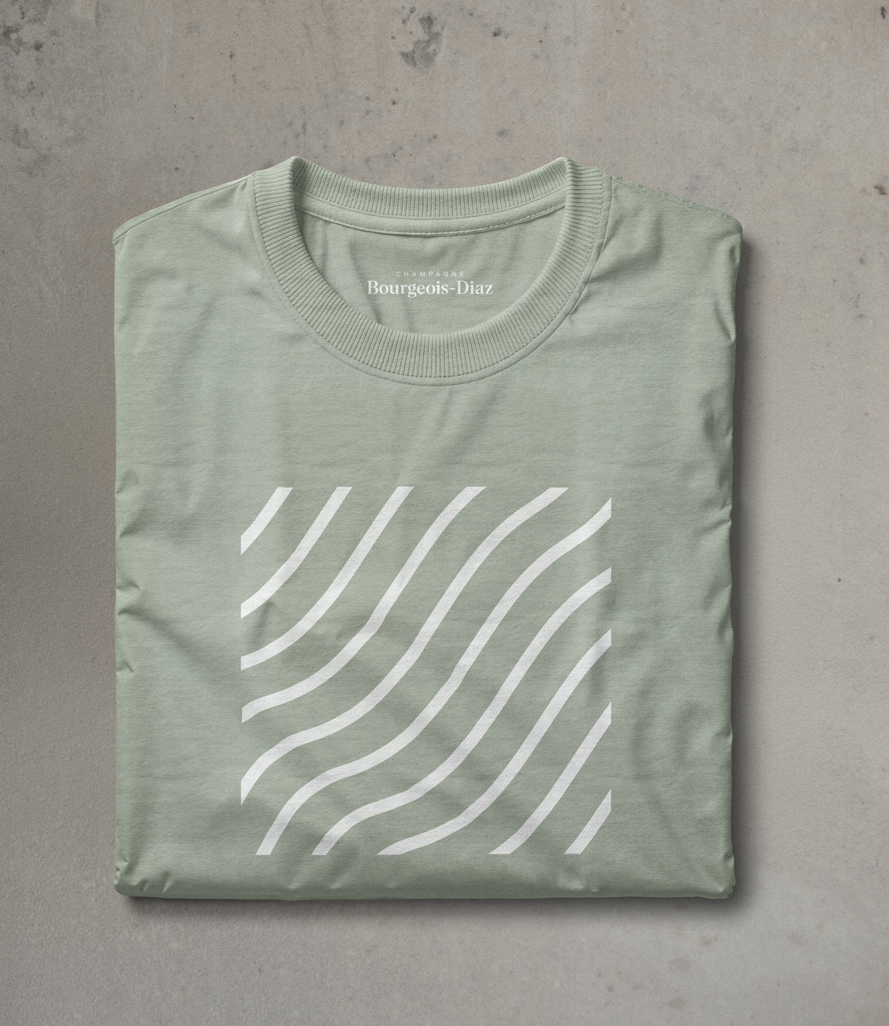
CRAFT / DIGITAL / IDENTITY / MERCH / PRINT
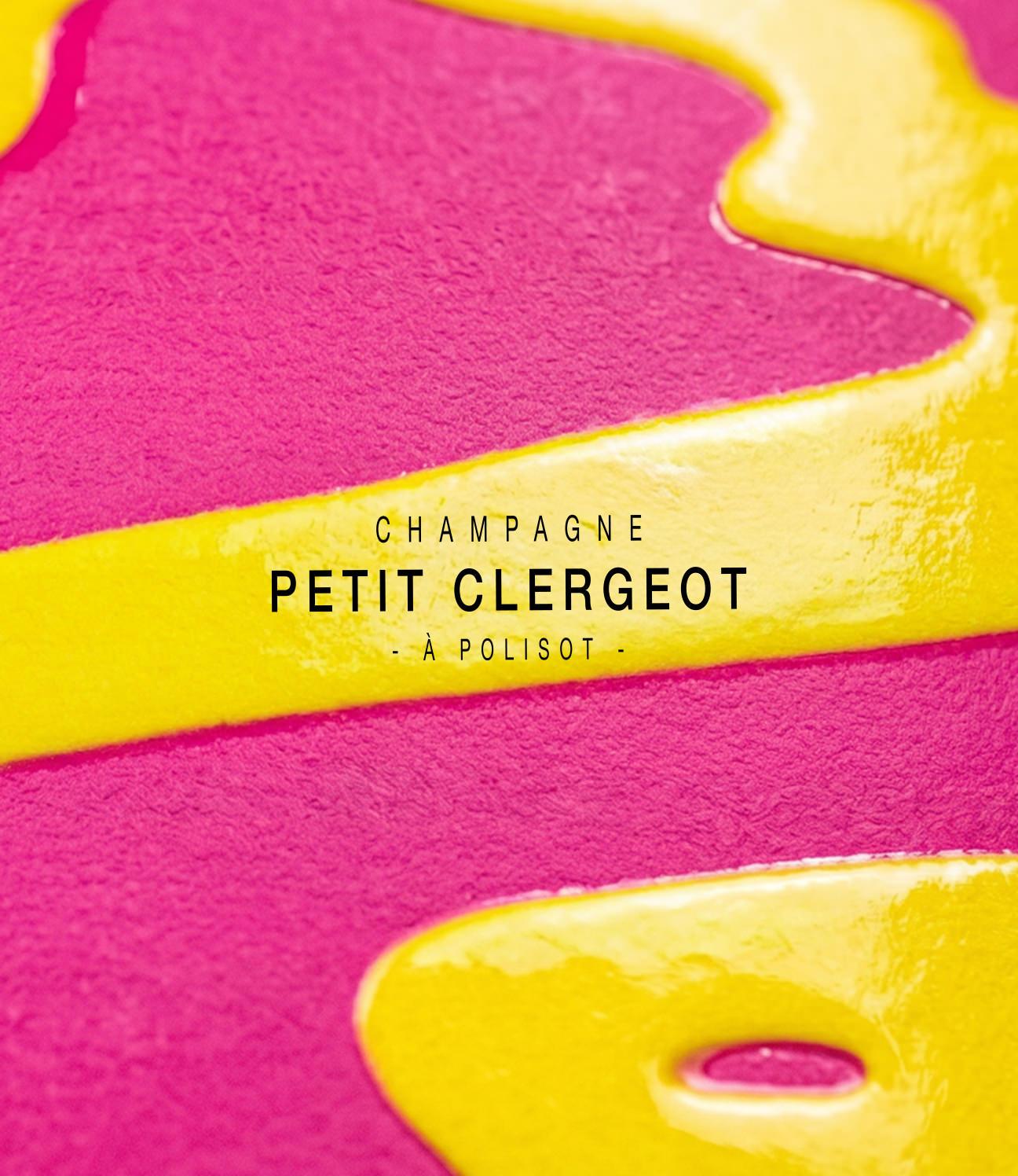
CHAMPAGNE BOURGEOIS–DIAZ
A house making champagne entirely by hand, without chemicals or shortcuts. We made the identity the same way.
Charlotte and Jérôme Bourgeois works the vines without chemicals and presses the grapes the traditional way, drawing the juice out slowly rather than pressing hard for volume. We wanted the identity to reflect and honour their approach: built by hand, in detail, without shortcuts.
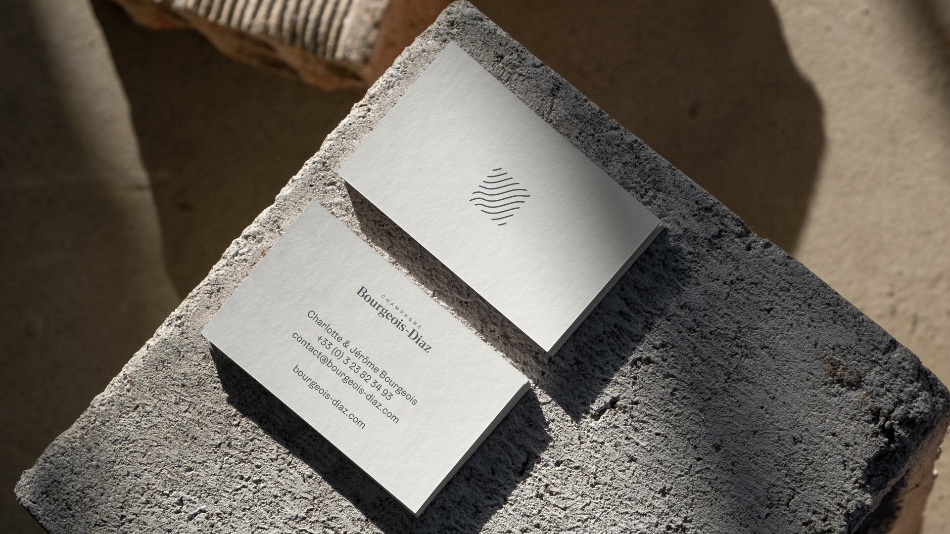
Rather than design from scratch, we kept a single line from the previous identity and reinterpreted it as the river Marne, which runs between the forest and the vineyards at Crouttes-sur-Marne. That mark became the basis for everything that followed.
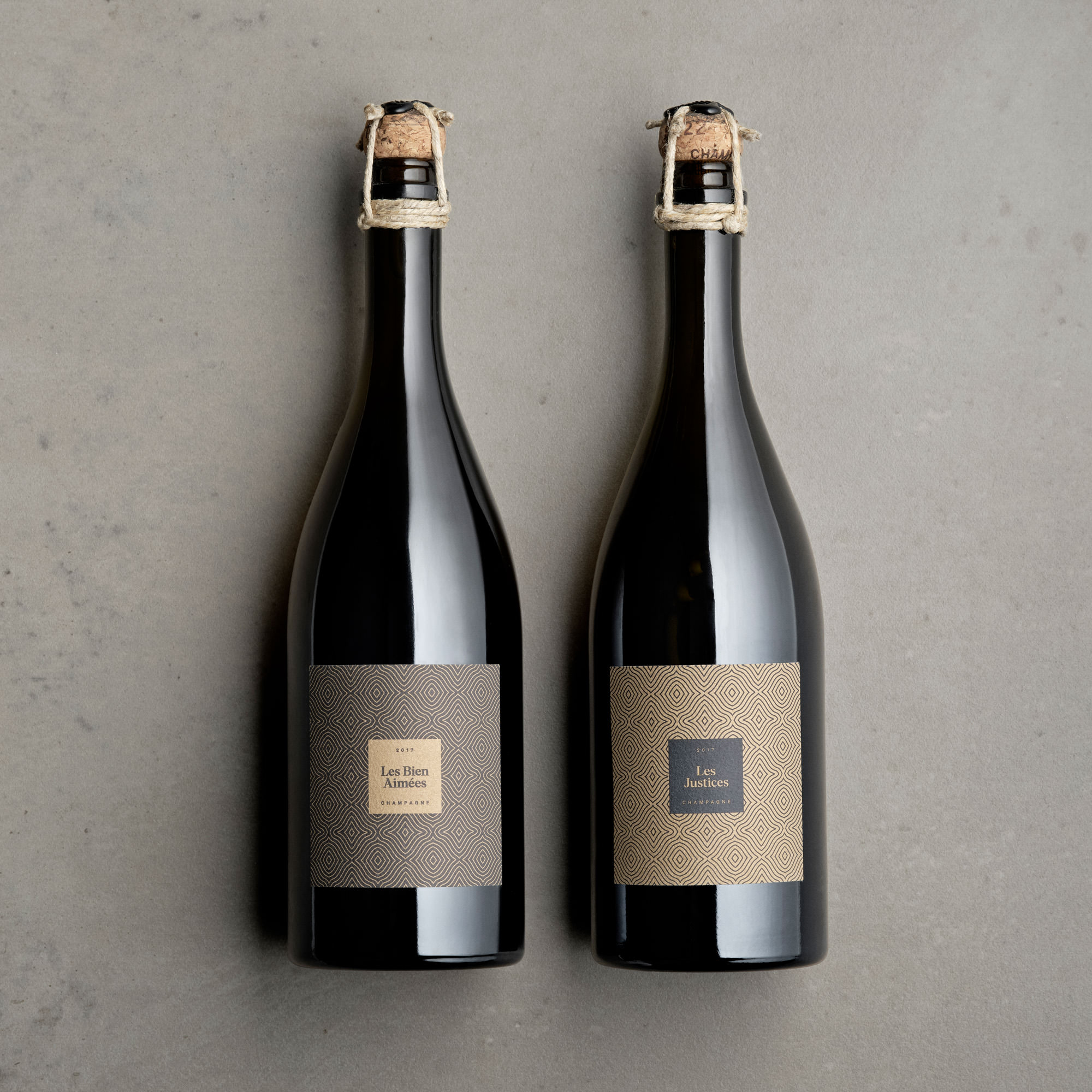
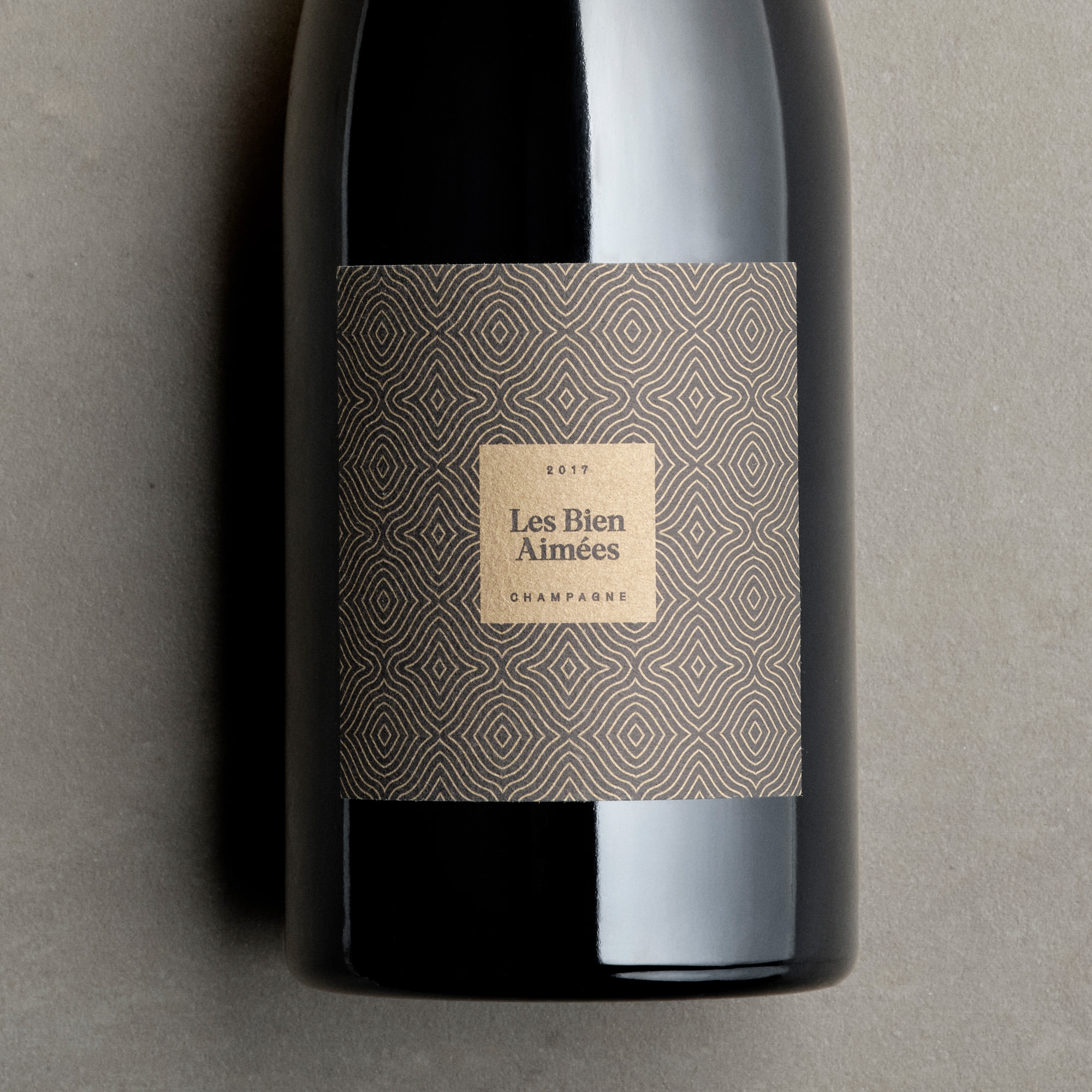
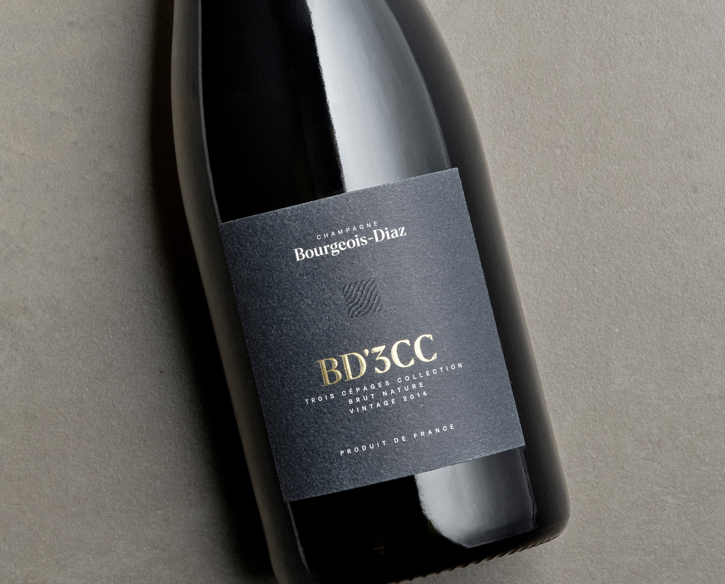
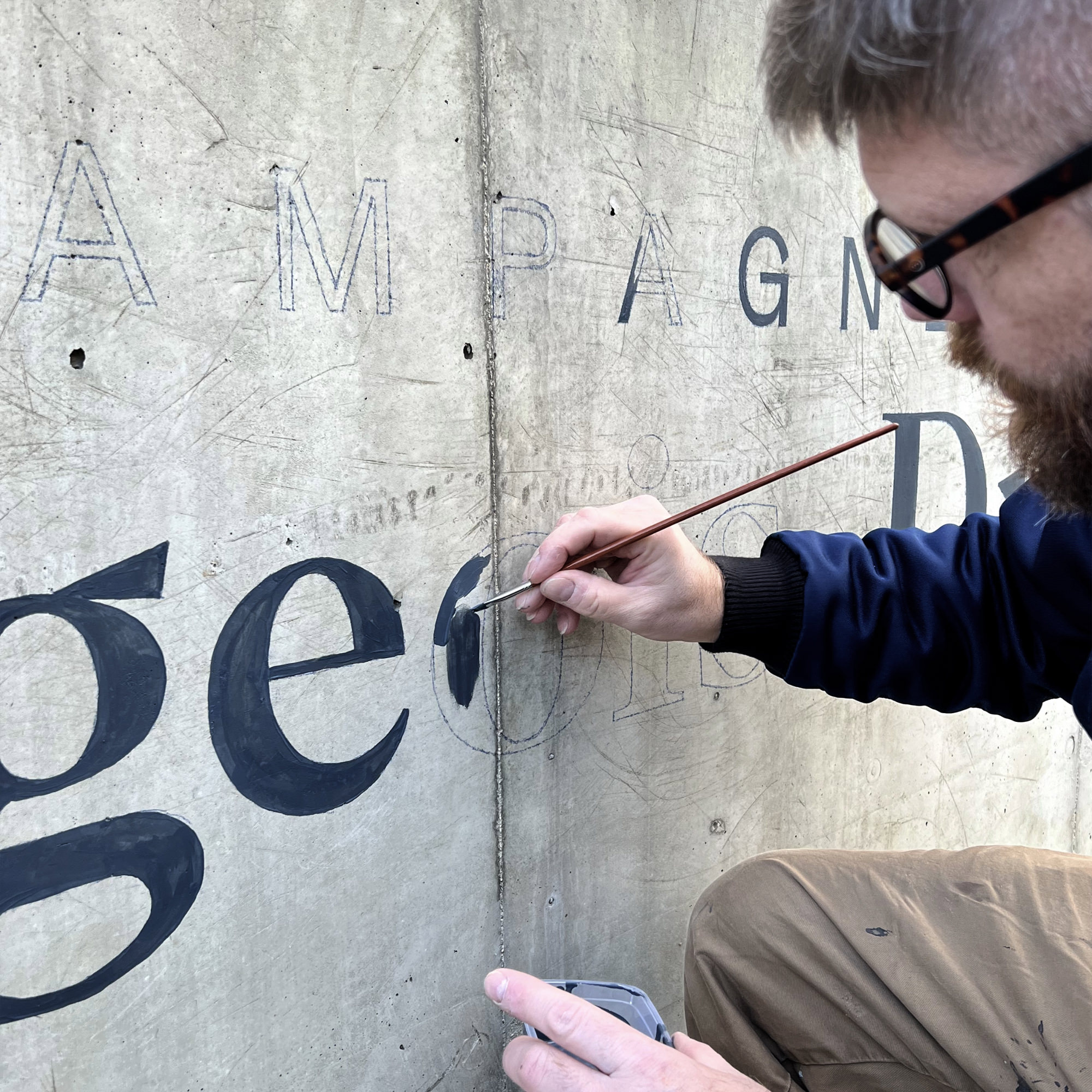
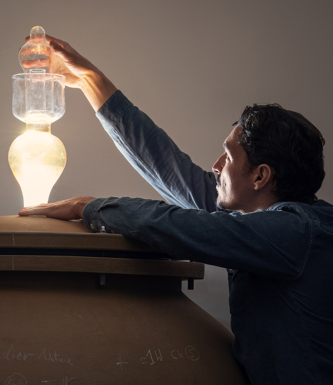
It appears across the range at different scales: a blind emboss on the core cuvées, visible mainly when the light catches it, and larger, more prominent applications elsewhere. The newer cuvées, Les Justices and Les Bien Aimées, use custom patterns finished with thread and wax closures. In the domaine's new cellar, a building by architect Thierry Bonne, we hand-painted the logotype directly onto the wall.
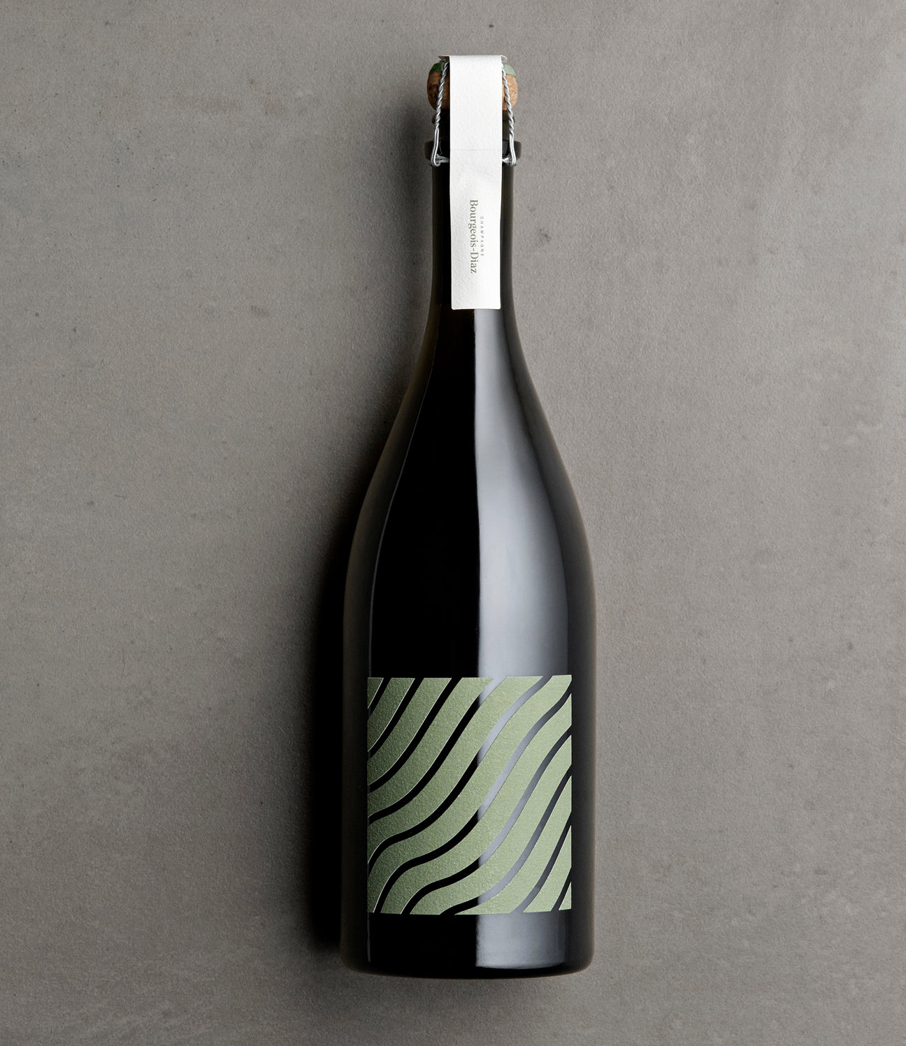
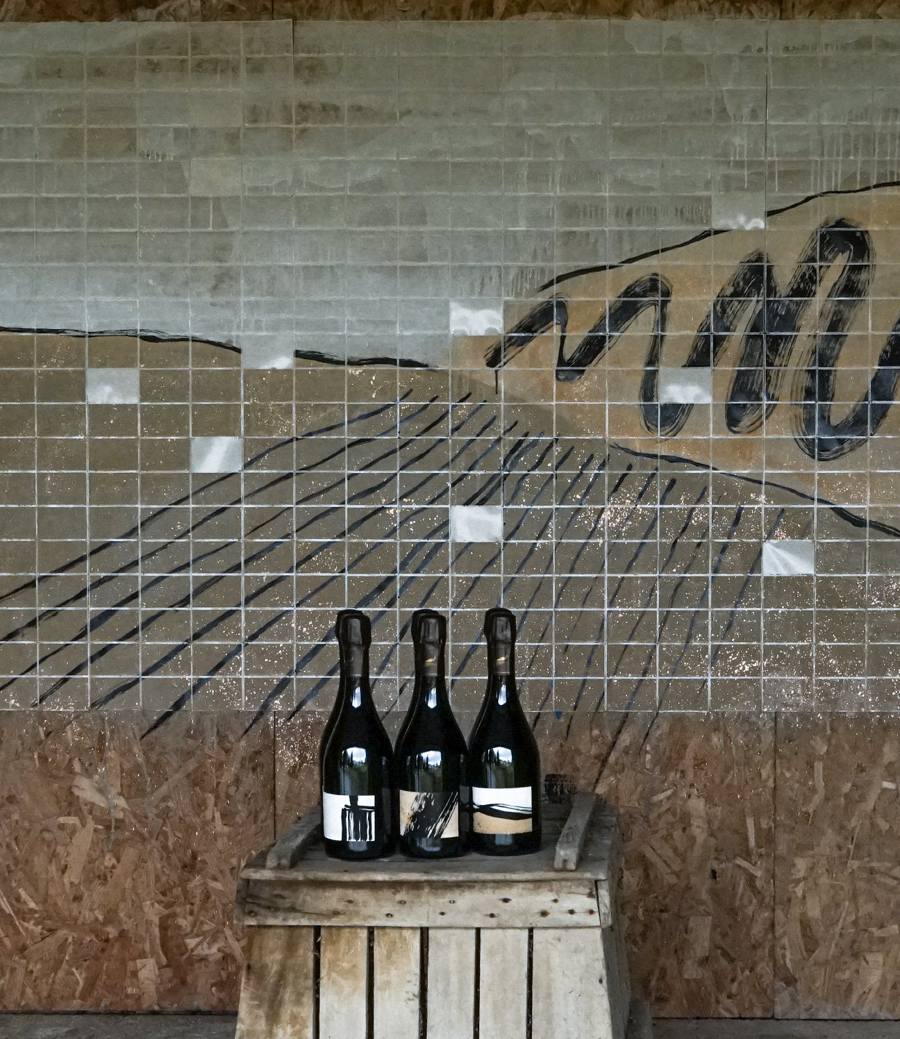
The scope included print materials and a full website, with more in progress. The clearest example of the approach is the most recent cuvée, ONDES.
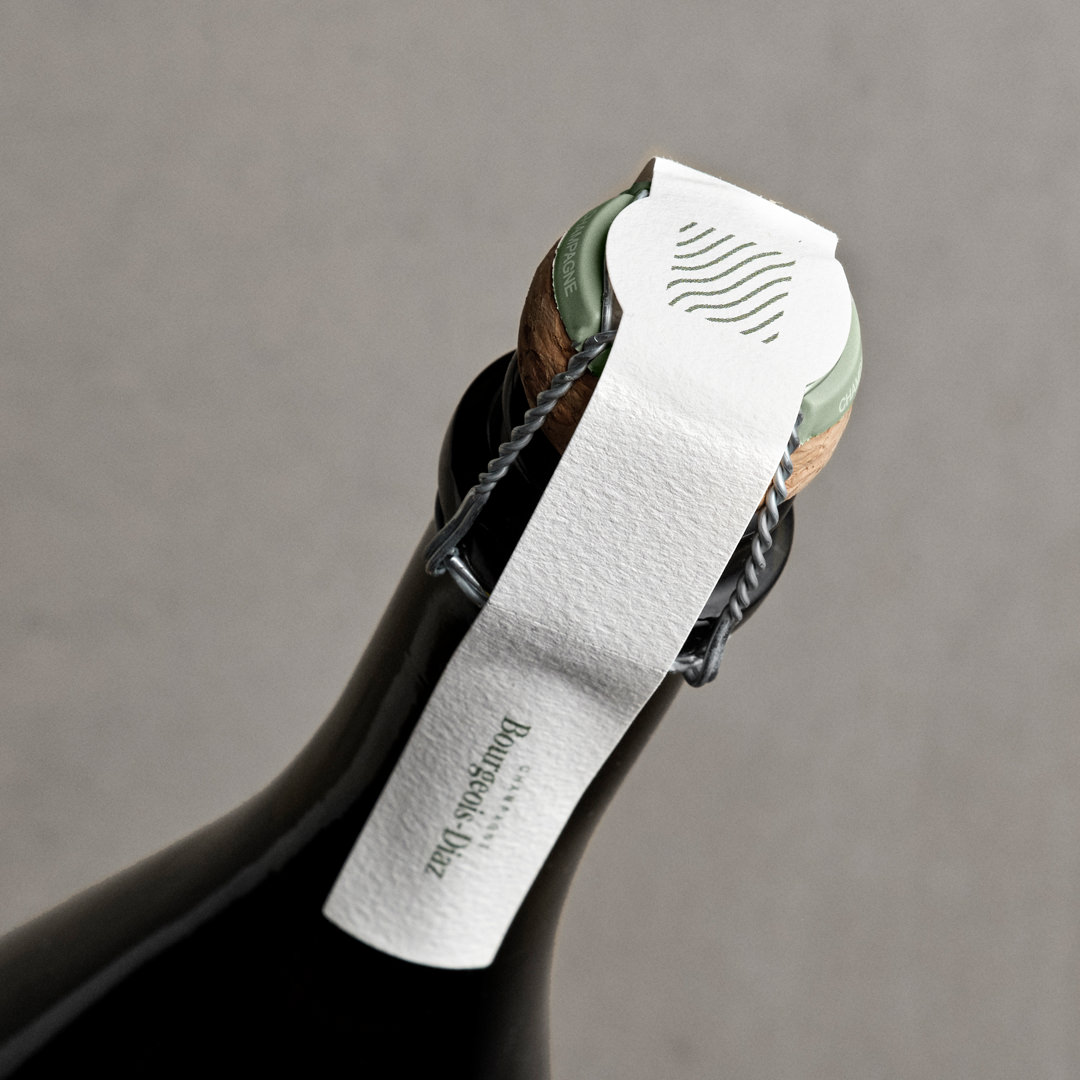
A LABEL AS PURE AS THE WINE
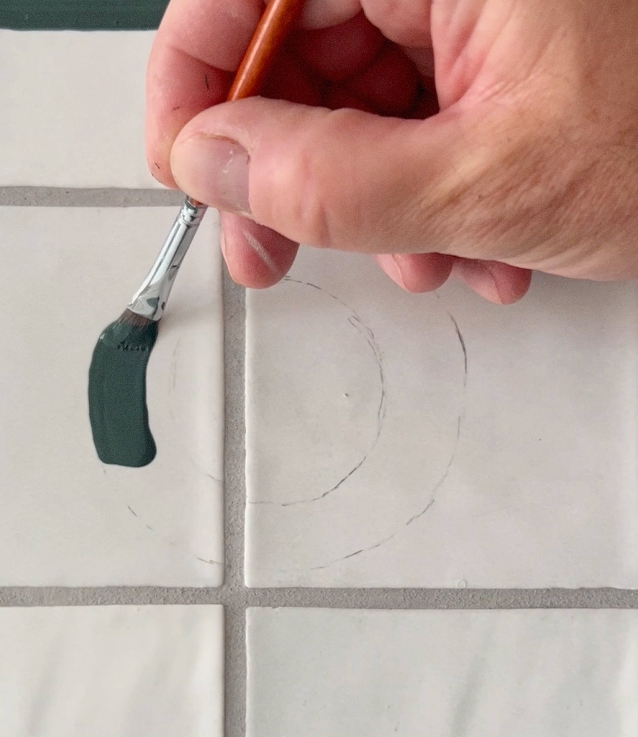
ONDES (translated as waves but also a subtle reference to mythological water nymphs known as ondines) is the domaine's first sulphite-free cuvée. The wine has nothing added to it, and neither does the label: the Marne mark is die-cut on its own, with no border or surrounding shape. It's white cotton paper, with the green colour printed on – no foil, and no coating.
The label cut cleanly, but it couldn't be applied by machine, and placing it accurately by hand was nearly impossible. We developed a manual method using tape, a hand roller, and careful alignment. Each label is positioned and applied by hand, one at a time.
Each one takes far longer to produce than a printed label would... made, like the wine, entirely by hand.
CREDITS
Designed and crafted by Formgiverne
Photography by Formgiverne, Rikke Westesen and Philippe Dureuil
Copywriting by Aaron Bateman
Techincal development by Sammy Grønvold Sbeinati
Architecture by Thierry Bonne
Printing by Imprimerie Gama
CLIENT QUOTE
"Since updating our brand and etiquettes, our sales have been growing. We highly recommend Formgiverne to handle your visual identity."
– Charlotte & Jérôme Bourgeois, Champagne Bourgeois–Diaz