CRAFT / DIGITAL / IDENTITY
BATEMAN'S
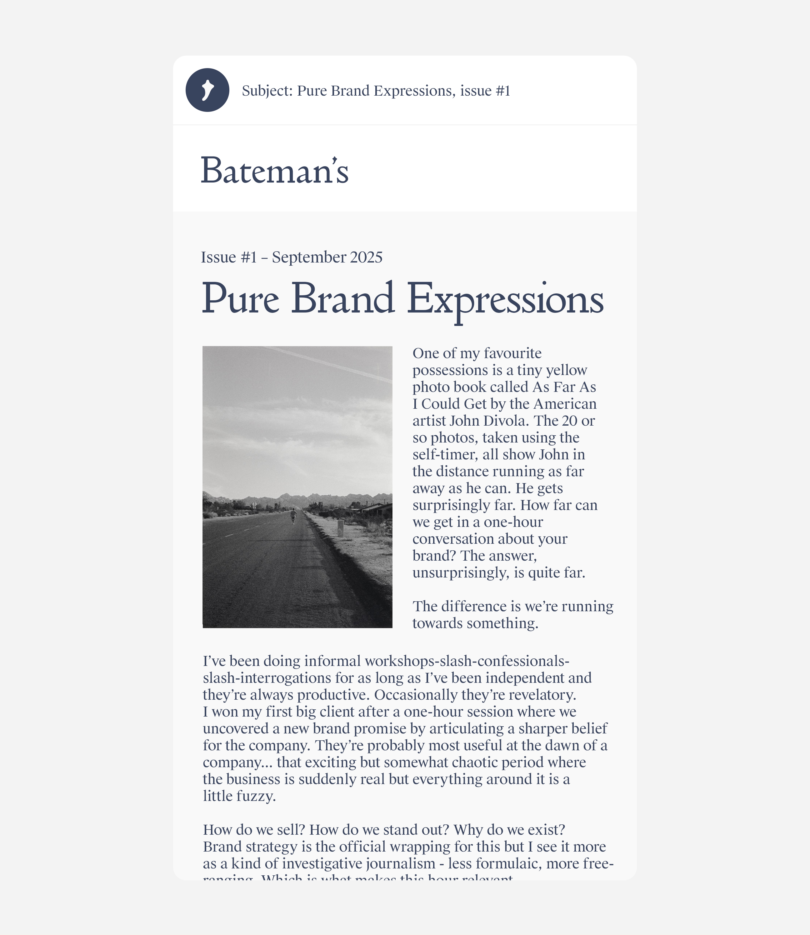
Bateman's is a one-man writing consultancy. For a business built on language, we let the typography do most of the talking.
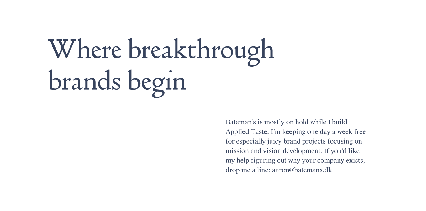
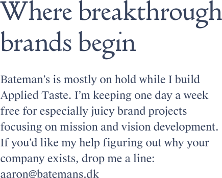
Bateman's is a one-man strategy and writing consultancy, shaping tone, language and narrative for brands working internationally in English. We kept the identity deliberately restrained – a calm, classic palette of deep blue and white – so nothing competes with the words.
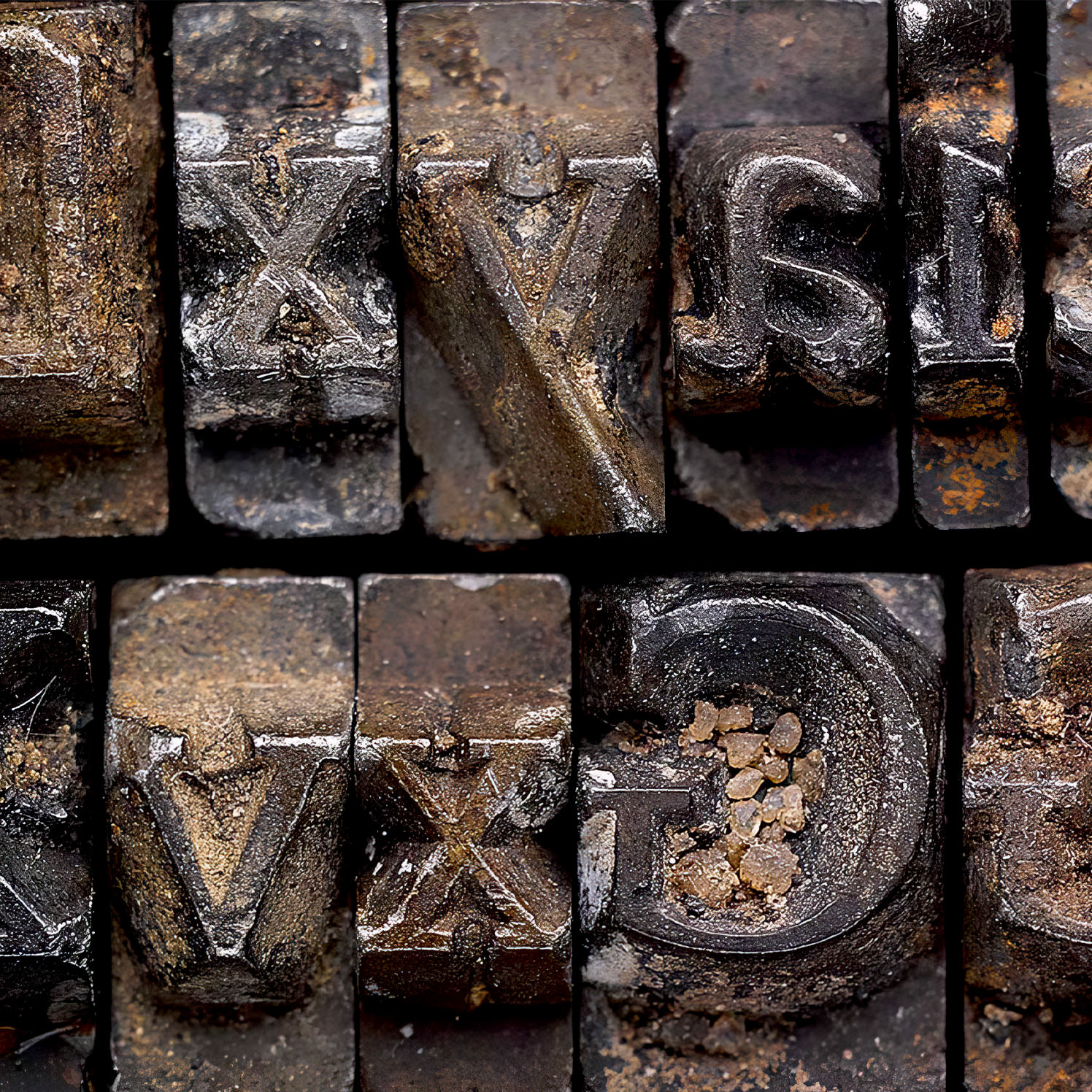
Most of it comes down to the typeface, and we spent a long time finding the right one. It turned out to be Doves Type, a serif with an unusual history: made in the early 20th century, its metal type was famously thrown into the River Thames after a falling-out between the two men who created it.
Decades later it was recovered from the riverbed and digitally reconstructed, which is how it's used again today.
That kind of stubborn dedication to craft made it the obvious choice for Bateman's. As a small extension, we made a limited run of steel bookends built around the typeface's distinctive apostrophe, enlarged. A piece of punctuation in steel, for a business made of words.
CREDITS
Designed and crafted by Formgiverne
Font design by T. J. Cobden-Sanderson/Doves Press
Font reproduction by Robert Green
Techincal development by Formgiverne and Sammy Grønvold Sbeinati
CLIENT QUOTE

"Robert and Cecilie created a new brand identity for Bateman's which brilliantly expressed my approach. They are excellent listeners – they took the time to understand me and how I wanted to be perceived. And they are true craftspeople. Their attention to detail and love for their work made the process a pleasure. I can't recommend them highly enough."
– Aaron Bateman,
Bateman's