CRAFT / DIGITAL / IDENTITY / MERCH / PRINT
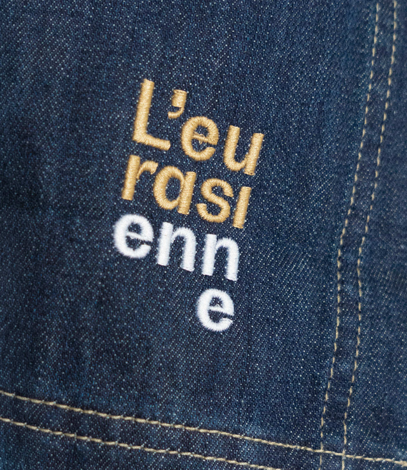
L'EURASIENNE
A restaurant in Épernay serving Vietnamese and Italian food – two cuisines that shouldn't go together, and somehow do.
L'Eurasienne pairs Vietnamese and Italian cooking, an odd combination handled with a light touch. We built the identity around that double act.
The logotype is stacked over four lines and split into two colours – two origins, one shape. The palette pulls from both kitchens: muted sage green, warm curry tones, soft pink. From a detail in the logotype we drew out a small symbol – somewhere between a flower, a star and a wheel – and used it across stamps, digital, and embroidery.
The illustrations carry the idea furthest. We drew ingredient studies by hand – vegetables, meats, seafood – then cut and recombined them into hybrids. Half carrot, half shrimp. Onion meeting duck. Familiar things, put back together slightly wrong.