DIGITAL / IDENTITY / PRINT
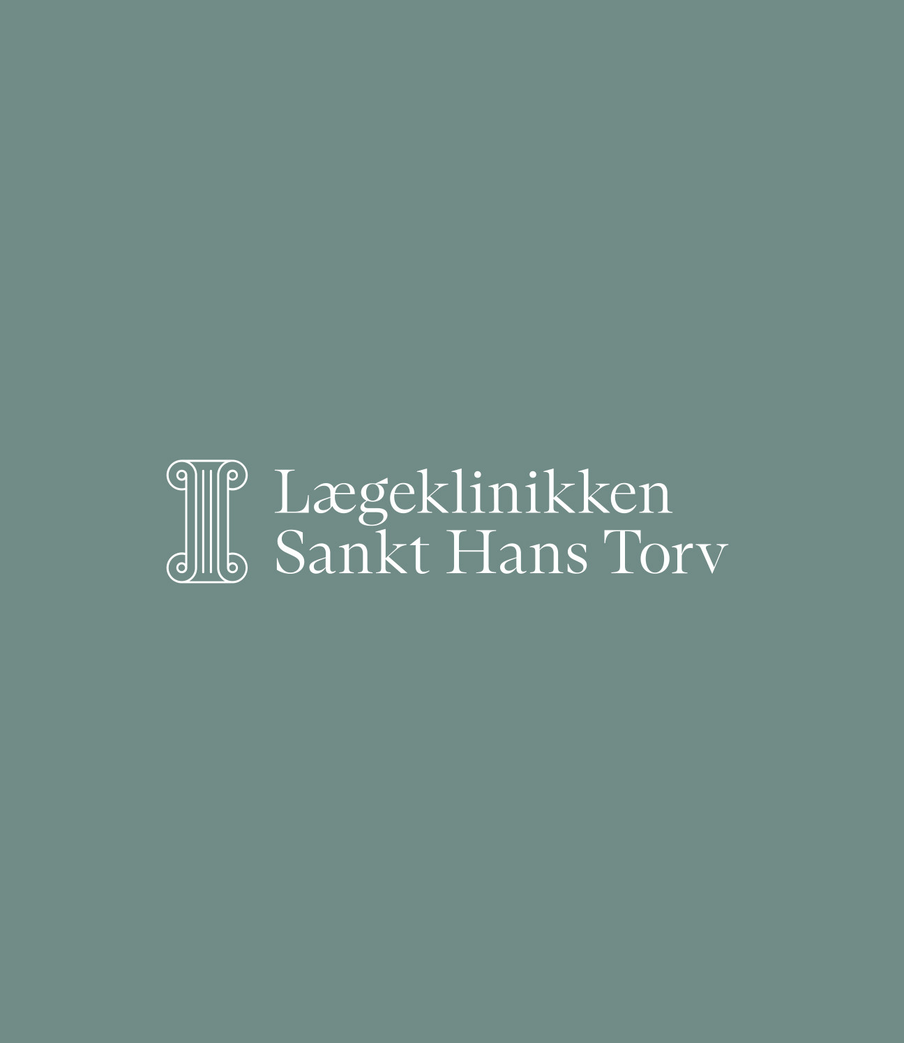
LÆGEKLINIKKEN SANKT HANS TORV
A Copenhagen medical practice. The new owner wanted it to feel less like a clinic and more like the building it's in.
A new owner had taken over the practice on Sankt Hans Torv and wanted to move it away from the usual generic healthcare look. We built an identity that feels more personal and precise instead. A classic serif logotype sets the tone, with a symbol drawn from the architectural details of the building's empire-style facade.
The website is built to be clear and easy to use – light, well-structured, nothing in the way. The clinic itself keeps its history: the original interior and period details are still there, so the place feels lived-in rather than fitted-out.
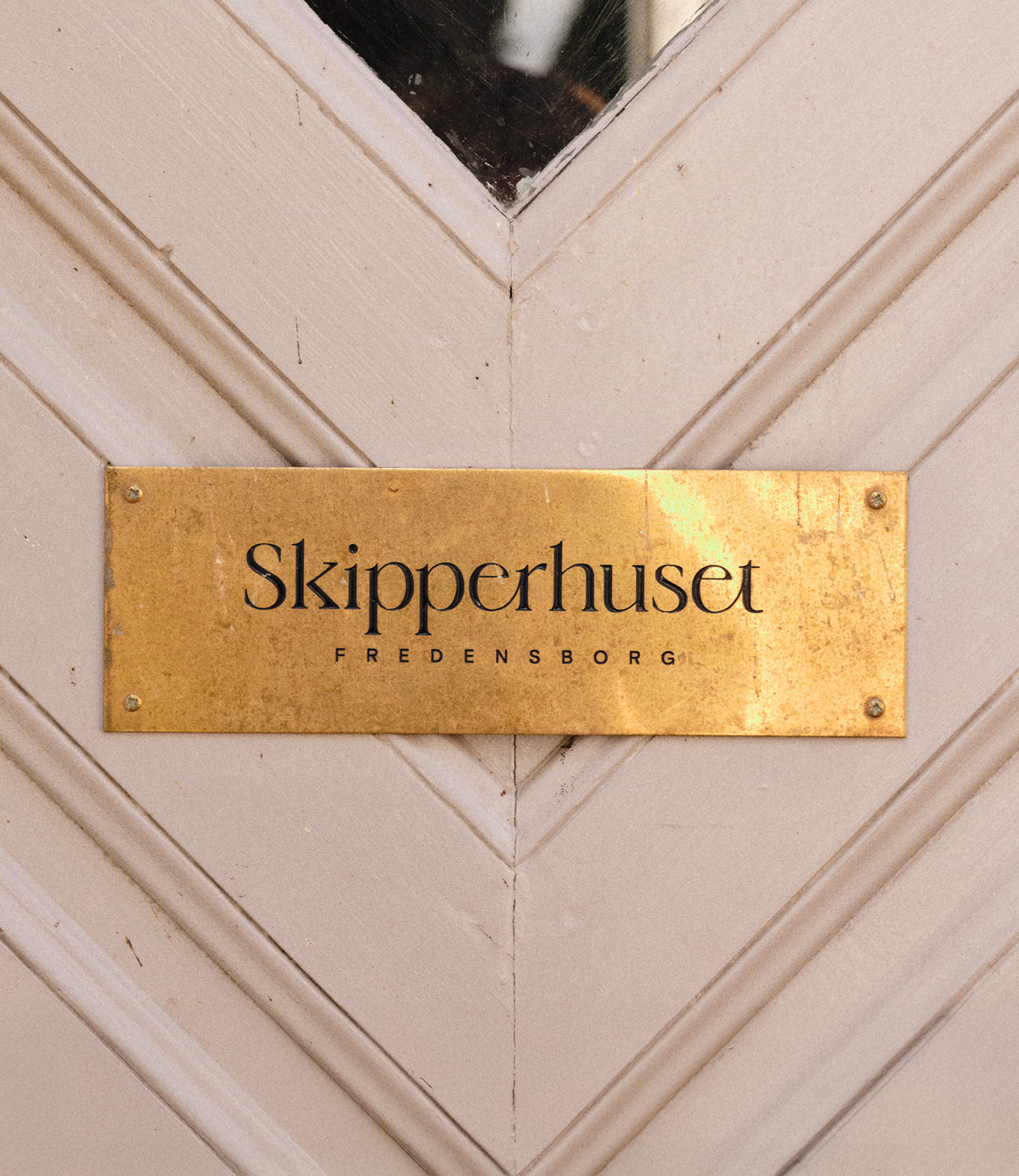
The palette is soft – whites and muted greens, somewhere between the clinical and the architectural – and the portraits are warm and natural rather than stock. In the space itself, the identity shows up as engraved brass signage, the one part of it you can actually touch.
CREDITS
Designed and crafted by Formgiverne
Techincal development by Formgiverne
CLIENT QUOTE

"Bla, bla, bla..."
– Anne Sofie Bateman,
Lægeklinikken Sankt Hans Torv