CRAFT / DIGITAL / IDENTITY / MERCH / PRINT
AU BON MANGER
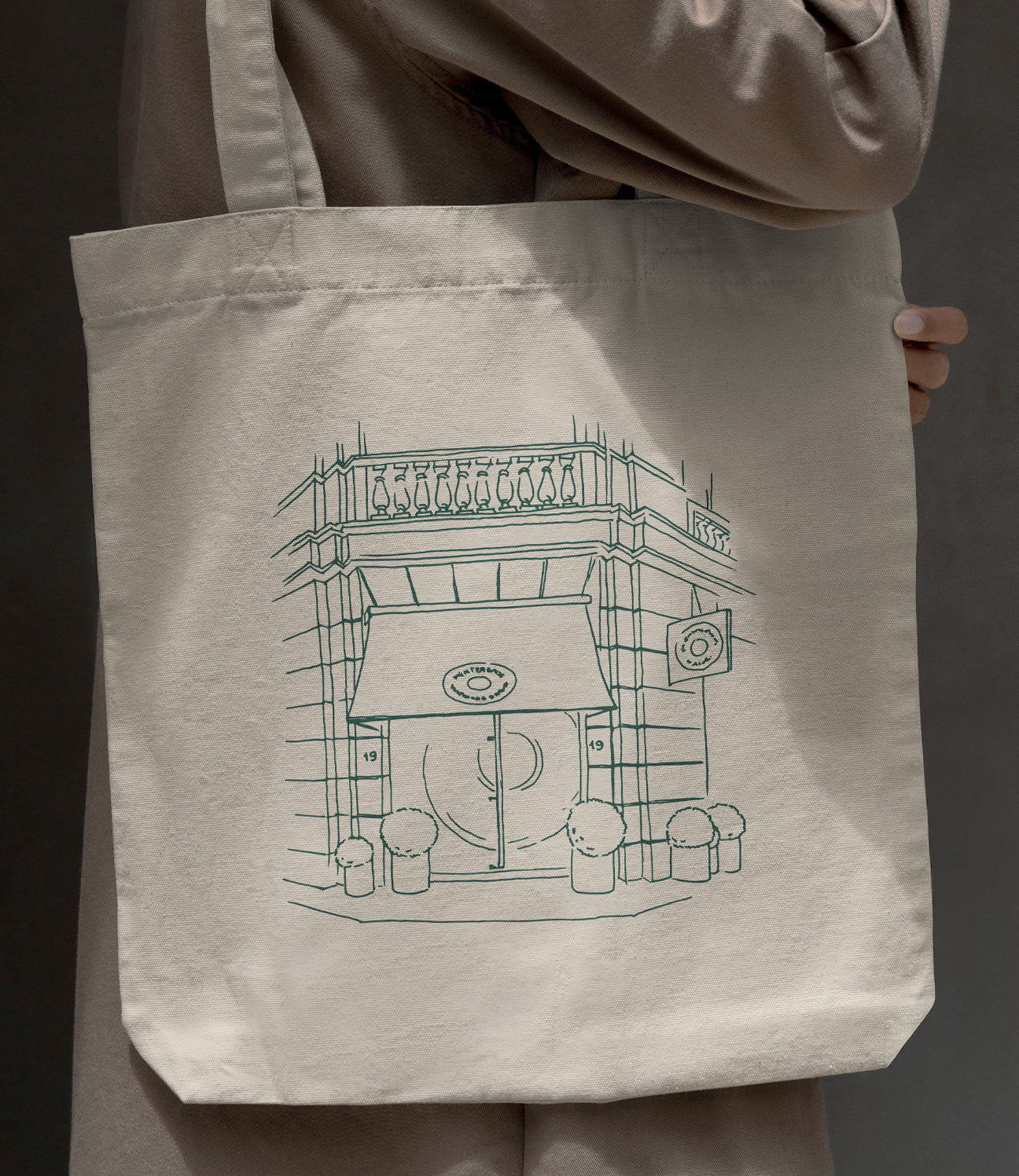
A small épicerie in Reims. There was no logo, no print, no website when we started – just Aline and Eric, and a very particular point of view.
Au Bon Manger was started by Aline and Eric around ingredients, origin and a real respect for quality. It ran on instinct more than system, and that's how the work began too: no logo, no printed matter, no digital presence, just a strong point of view and a particular atmosphere.
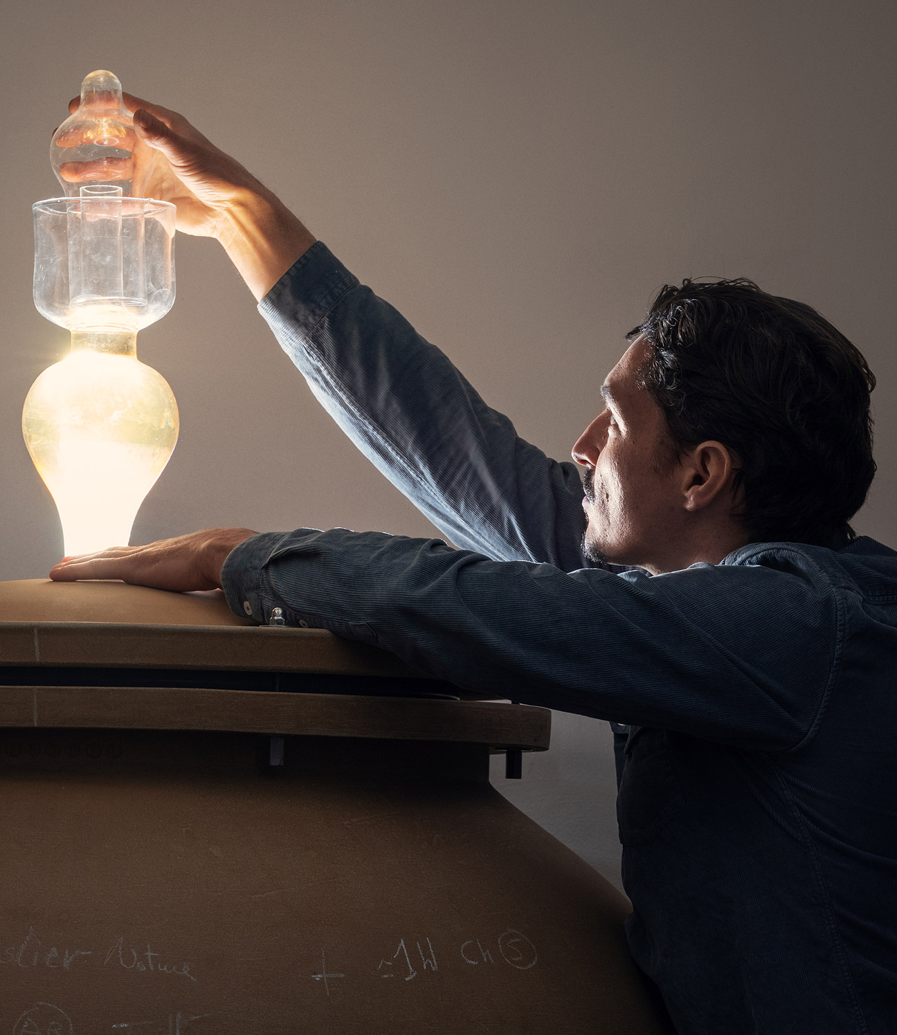
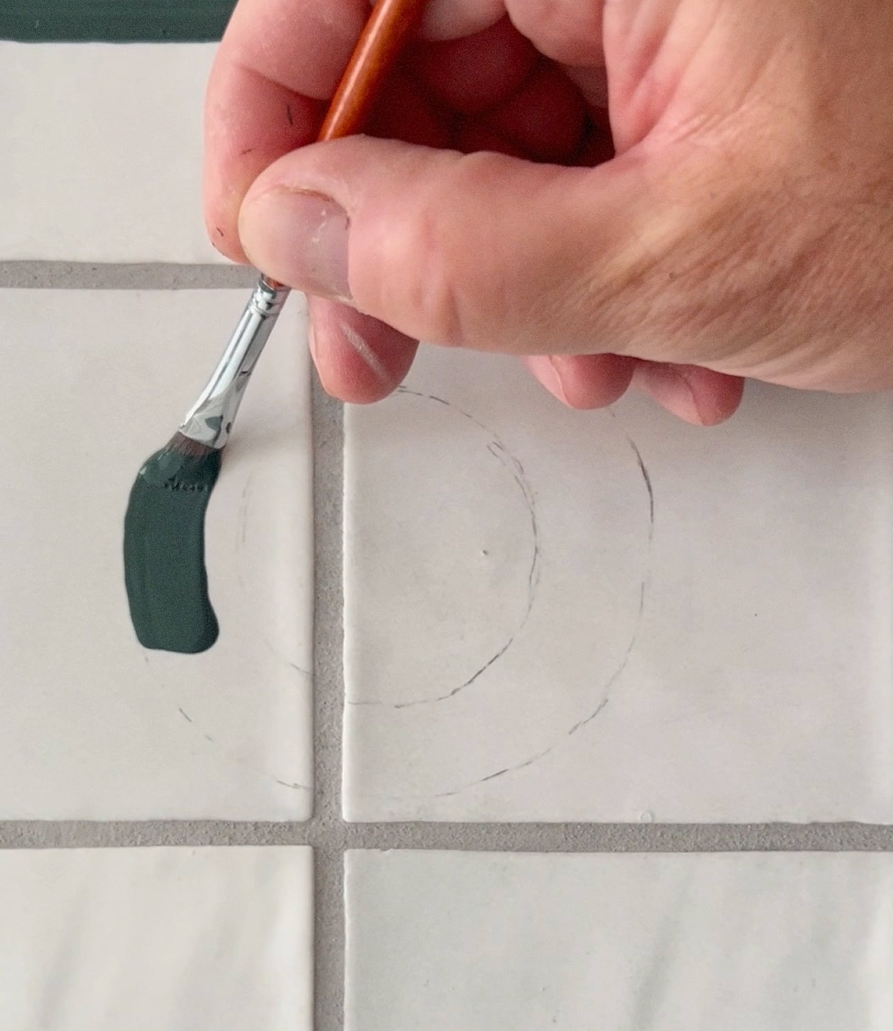
The identity came out of a hands-on process. Champagne corks were both the material and the method – we cut, shaped and stamped them to build the logotype. We filmed the whole thing, from raw cork to finished mark, and Eric scored it afterwards on an improvised kalimba.
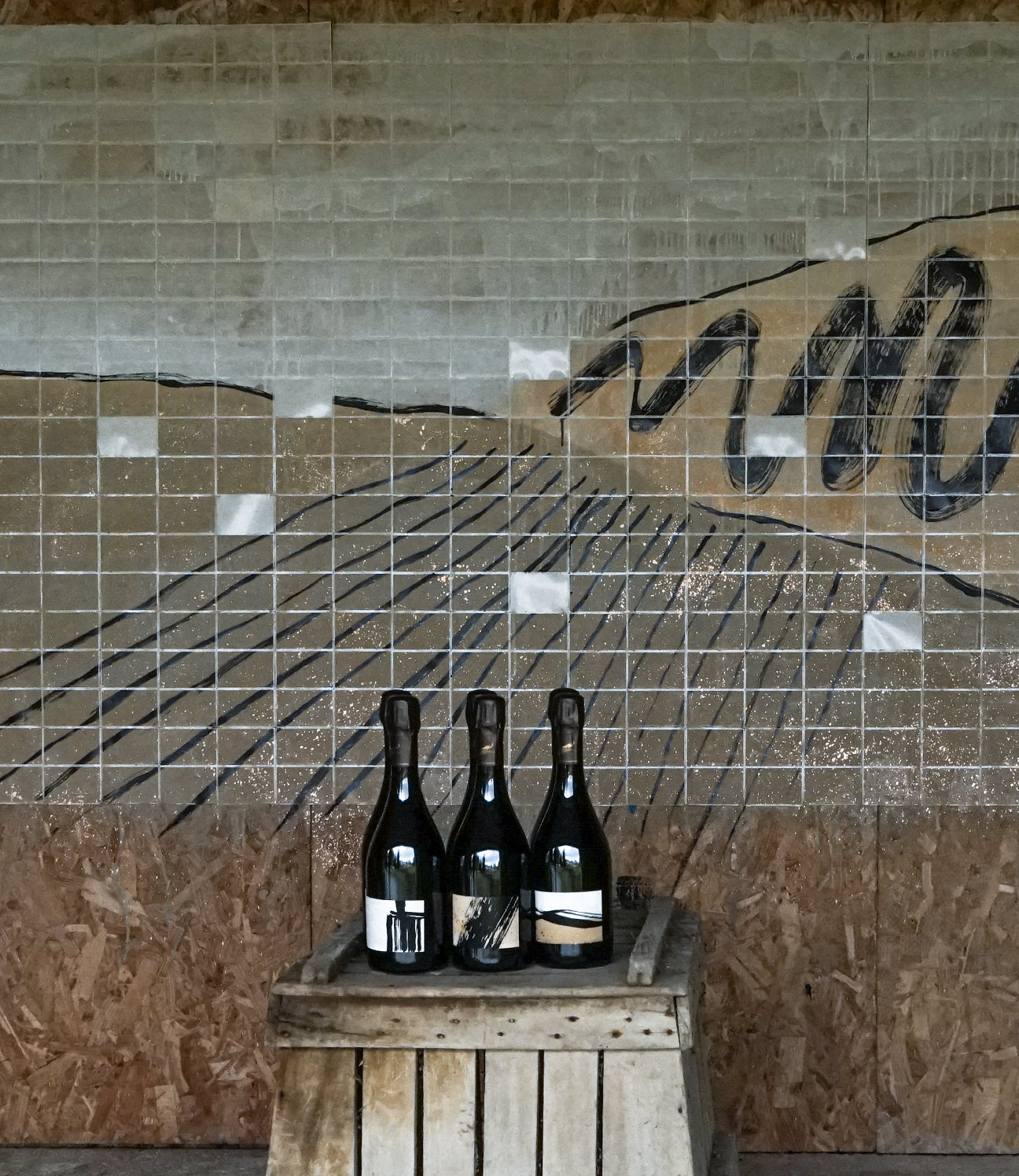
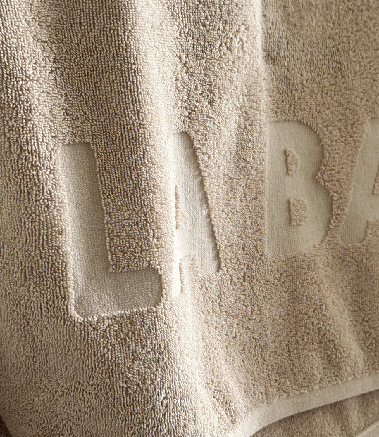
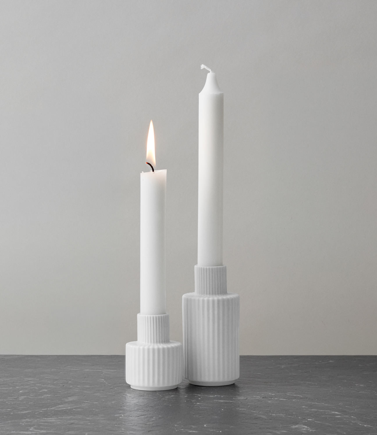
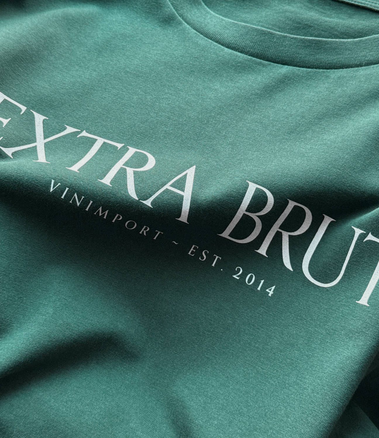
The logo keeps that origin in it: built from cork imprints, tactile and a little improvised, but clear. We set it against a bold ultramarine, which plays off the rustic room – worn wood and marble – with something sharper and more current. From there it ran out across menus, print, merch and a website.
WHERE THINGS TOOK ROOT
This was also a beginning. The work here led to other projects and other people – the kind of thing that grows out of sitting at the same table long enough.
CREDITS
Designed and crafted by Formgiverne
Photography by Formgiverne
Documentation moive by Formgiverne
Sound design by Steffen Breum
CLIENT QUOTE

"Bla, bla, bla..."
– Aline Serva,
Au Bon Manger