CRAFT / DIGITAL / IDENTITY / PRINT
LA ROAR LIFE SCIENCE
A Danish supplement brand for fertility, pregnancy and postnatal health. We built it an identity that's precise without being clinical.
La Roar Life Science makes portioned supplements for fertility, pregnancy and postnatal health, with a growing range of single products, all produced in Denmark. The brief sat between two things: the science behind the products and the care they're really about.
We built the identity around a bold, confident logotype. The wordmark is clean, with one quiet move – the "O" in ROAR is stretched into an oval capsule, which reads as both the product and the body it's made for. In motion, the capsule expands and contracts, a small bodily rhythm.
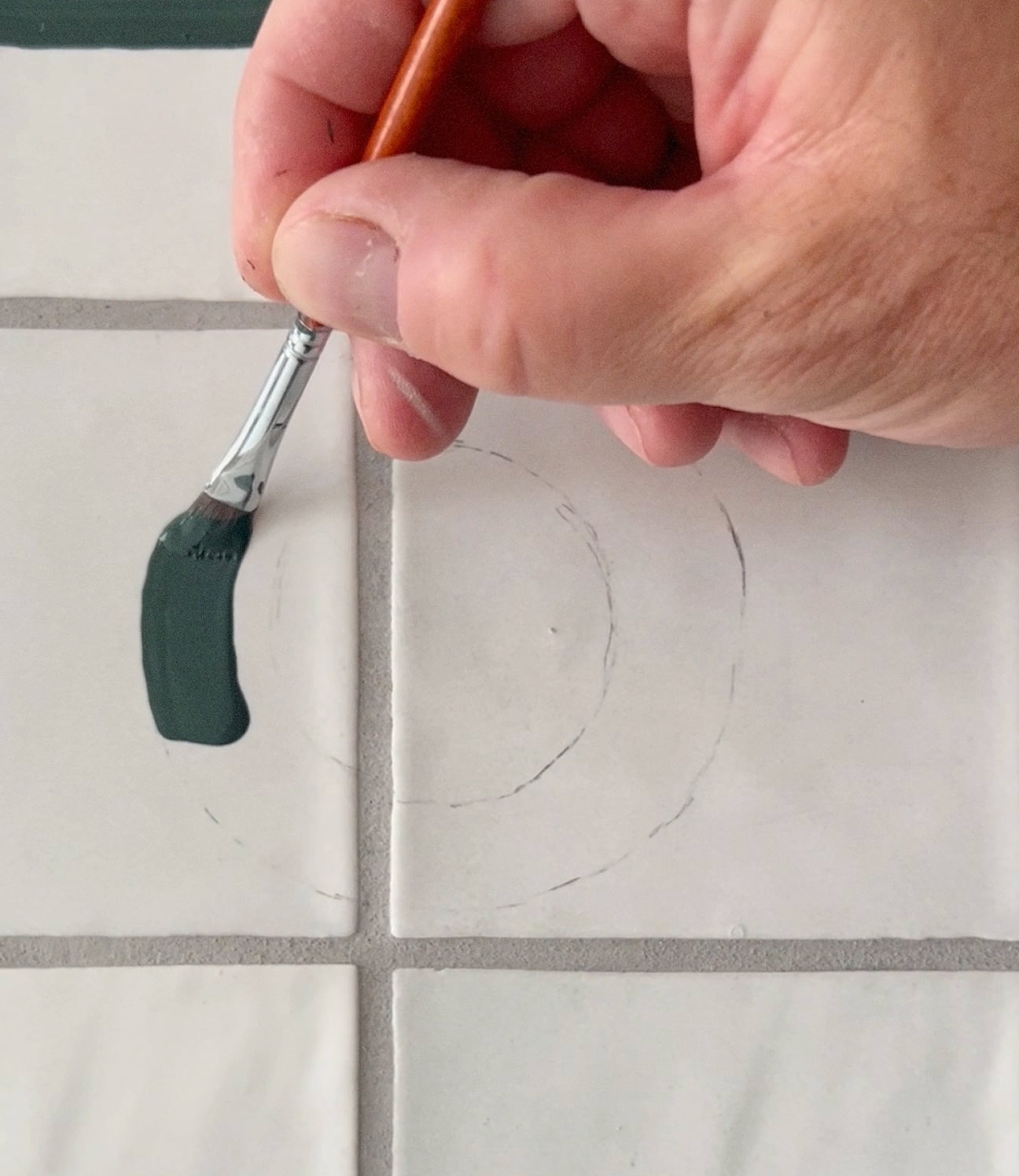
Against that, a set of abstract watercolours adds a softer, hand-made layer – organic shapes and muted tones that change from product to product but stay quiet and consistent.
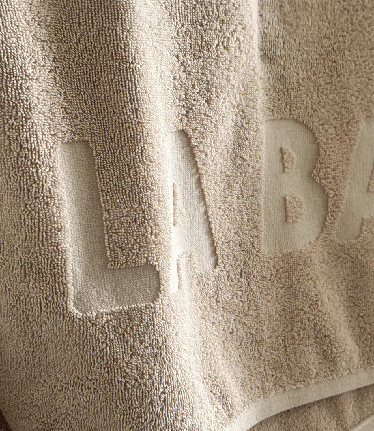
The work covers the full product: packaging – boxes, sleeves, sachets, bottles – and, more recently, an embossed quality mark, "Danish Bio Lab Formula since 2018," pressed into the material itself. A small, permanent mark of where it's made.
CREDITS
Designed and crafted by Formgiverne
Photography by Rikke Westesen
CLIENT QUOTE

"Bla, bla, bla..."
– Tine Stampe,
La Roar Life Science