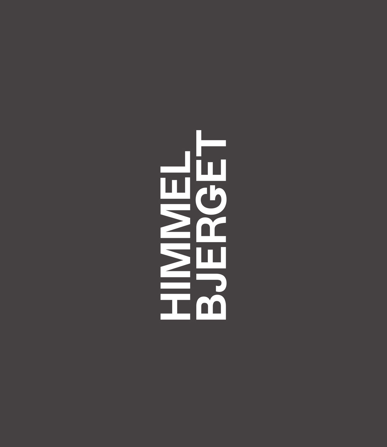
DIGITAL / IDENTITY
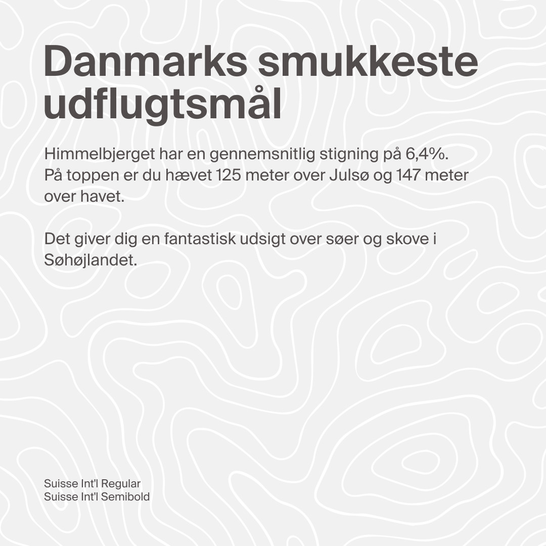
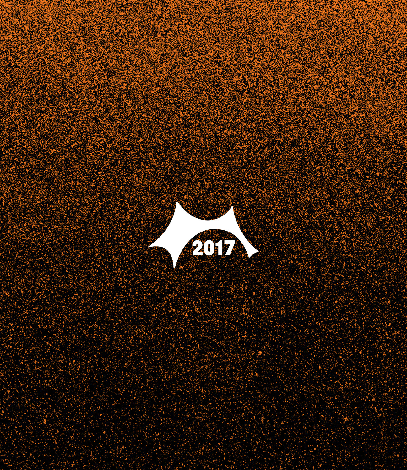
HIMMELBJERGET
One of Denmark's best-known landscapes. Tårnkomiteen asked us for a digital platform to look after its history – which turned into a new identity as well.
Tårnkomiteen came to us for a digital platform to help communicate and preserve what Himmelbjerget means. It became clear early on that a website alone wouldn't do it – the identity needed refreshing too, to pull everything together and make it more recognisable.
So the work covered UX, UI and the visual identity in one go: a new logotype, new typography, a single colour palette, and custom patterns – a contemporary frame for a place with a lot of history behind it.
Shaped by the Landscape
The whole visual concept comes from the hill itself. The logotype takes the silhouette of the historic tower at the summit and turns it into letterforms – stable, and meant to last.
Then there's the angle. The design is structured around 6.4 degrees – the mountain's average incline. It's a quiet, almost invisible detail, but it ties the screen back to the actual terrain without ever spelling it out.
CREDITS
Designed and crafted by Formgiverne
Project management by Marketsquare
Techincal development by Marketsquare