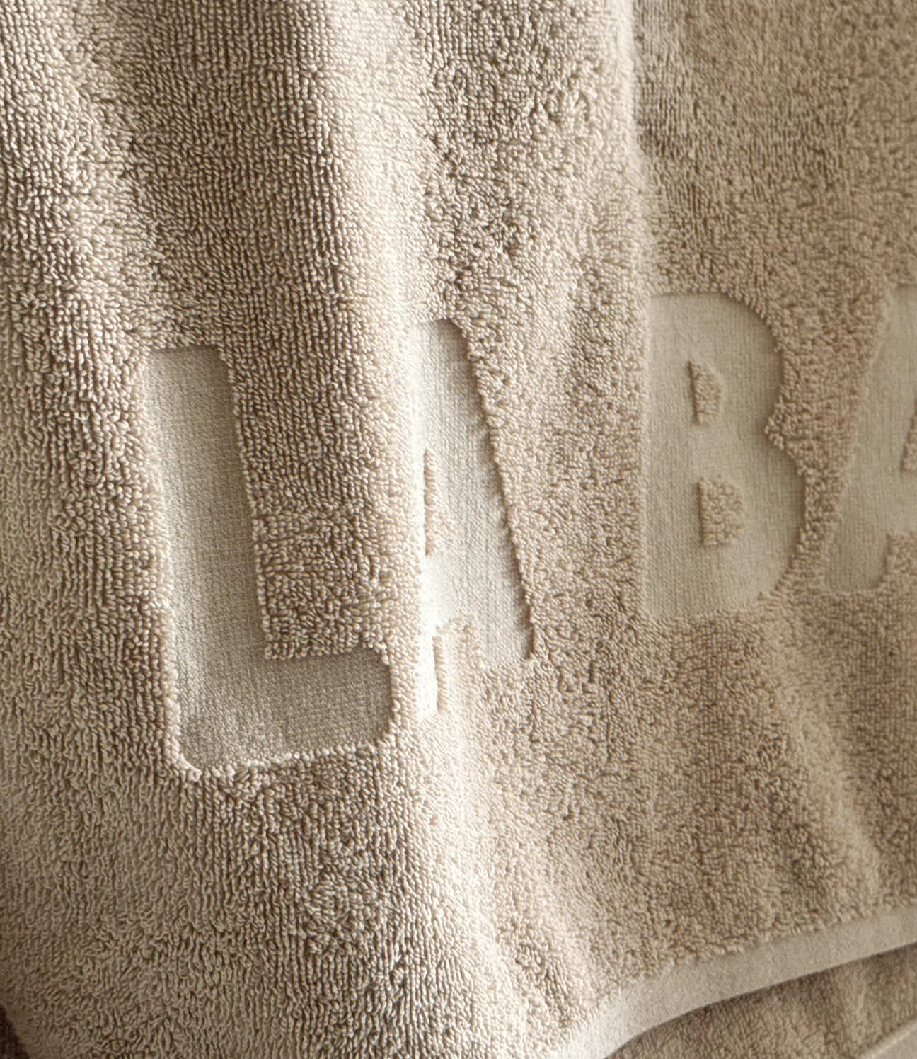
IDENTITY / PRINT
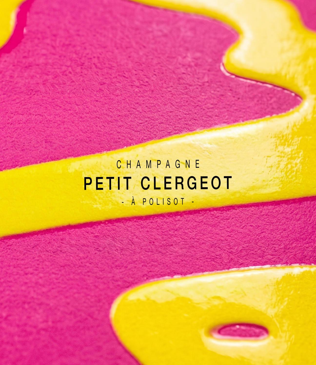
BRUNO BIENAIMÉ
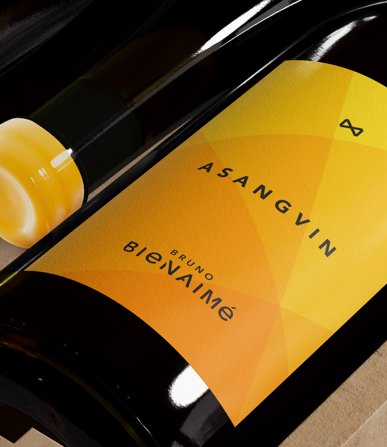
A winemaker who decided to leave the AOC – France's wine appellation system – it meant losing the right to specify grape varieties on his labels. He asked us to find another way to distinguish his cuvées as part of a refreshed identity.
Leaving the AOC gave Bruno more freedom in how he makes the wine, but forced him to rethink how to set his wines apart. Our job was to preserve each cuvée’s distinctive character while making it possible to identify the specific grape variety.
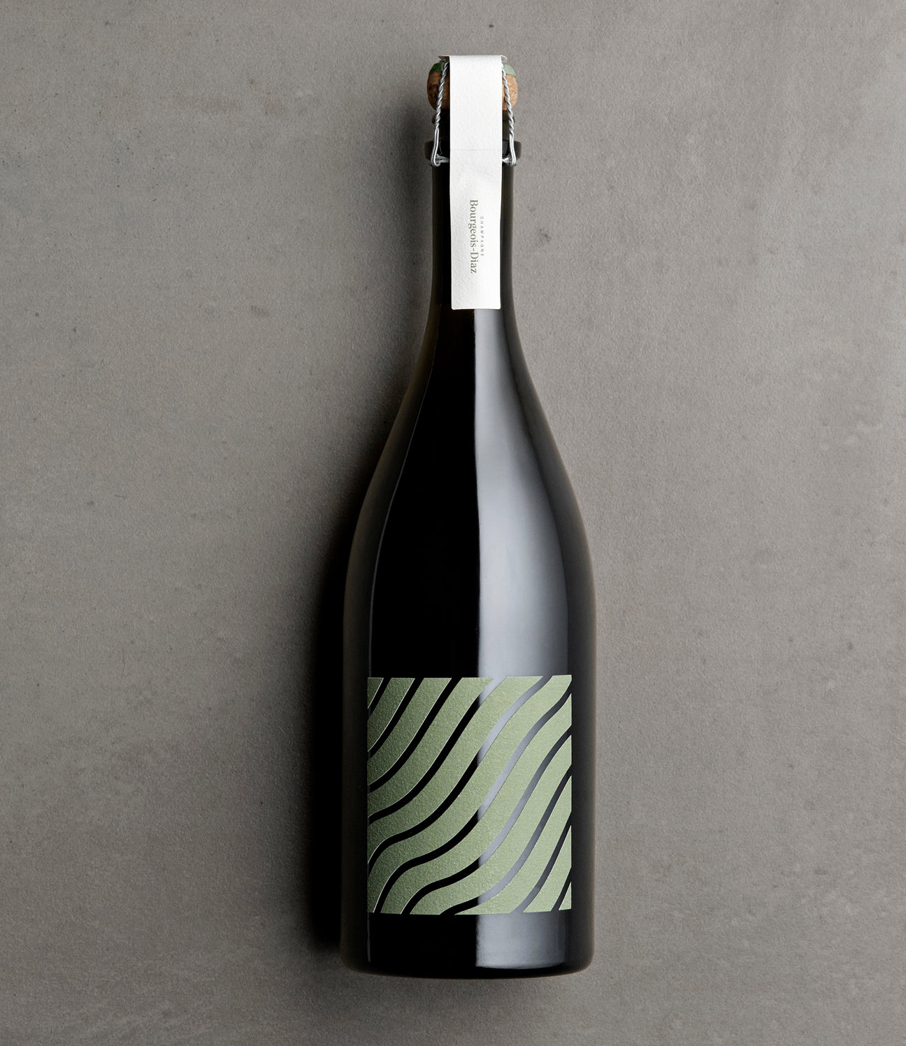
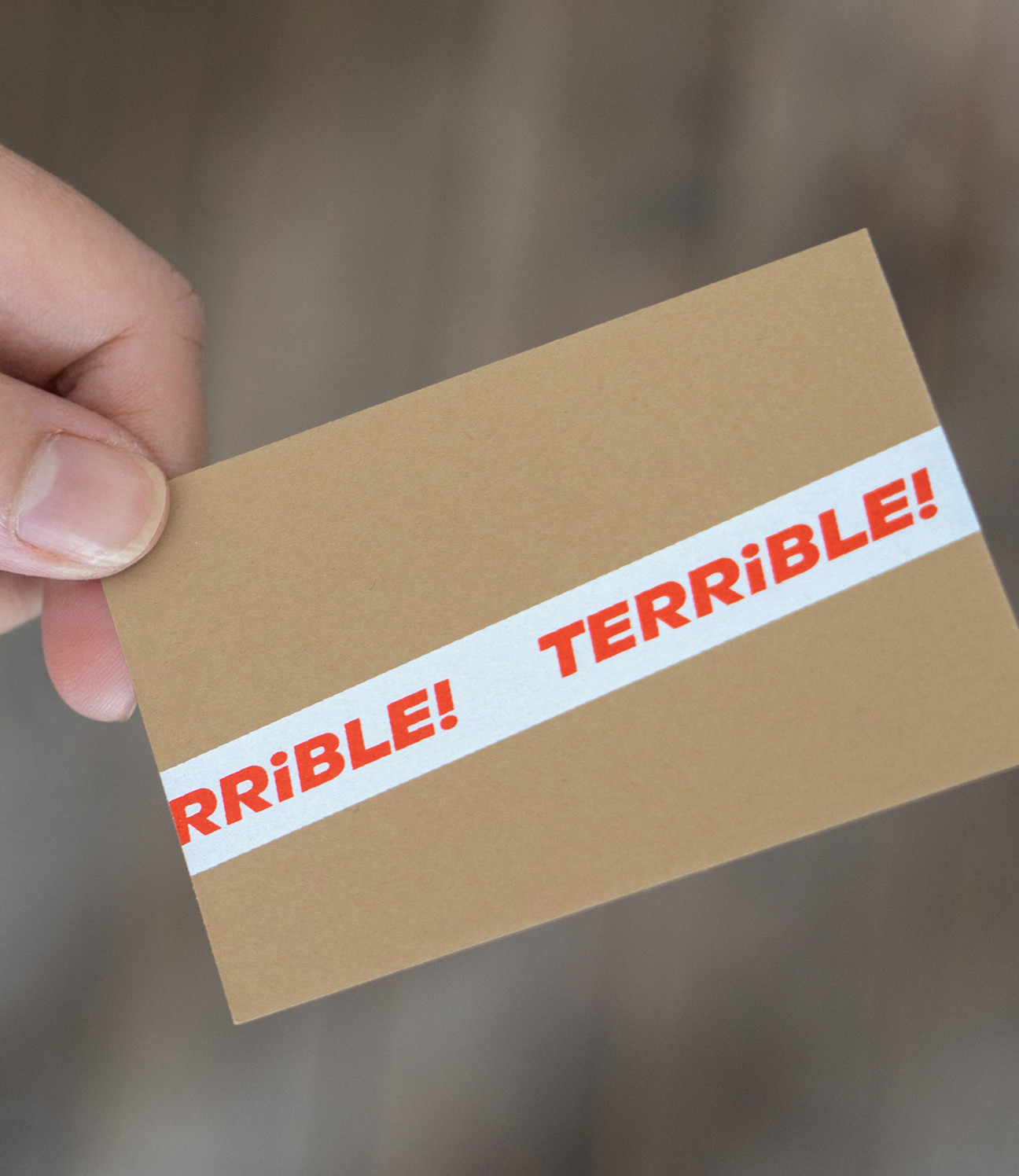
Anagrams were the answer. Chardonnay became ARDONHANCY and Savagnin became ASANGVIN. The remaining cuvées follow the same concept. The letters are all there for anyone who looks, but to the regulators, it reads as a new word.
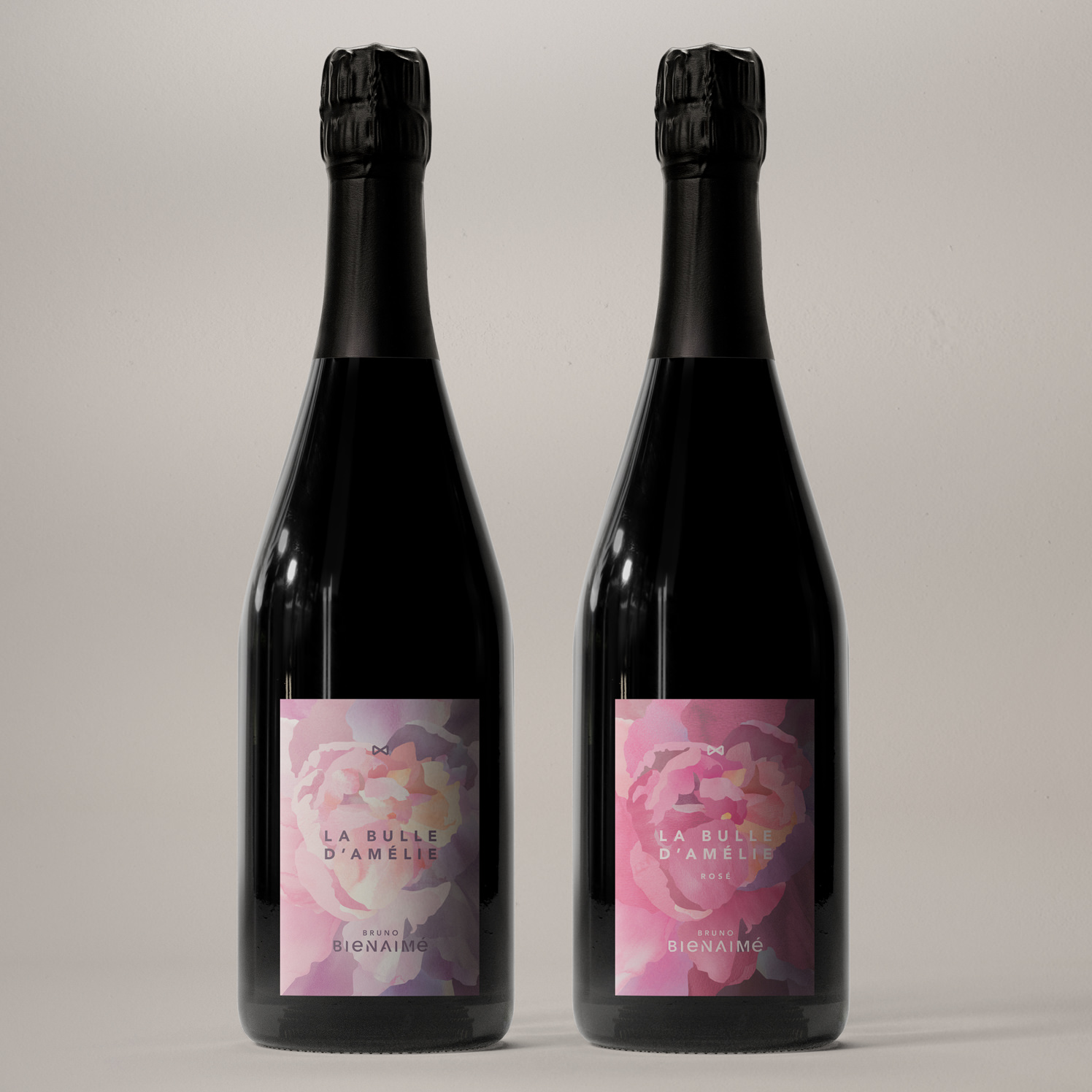
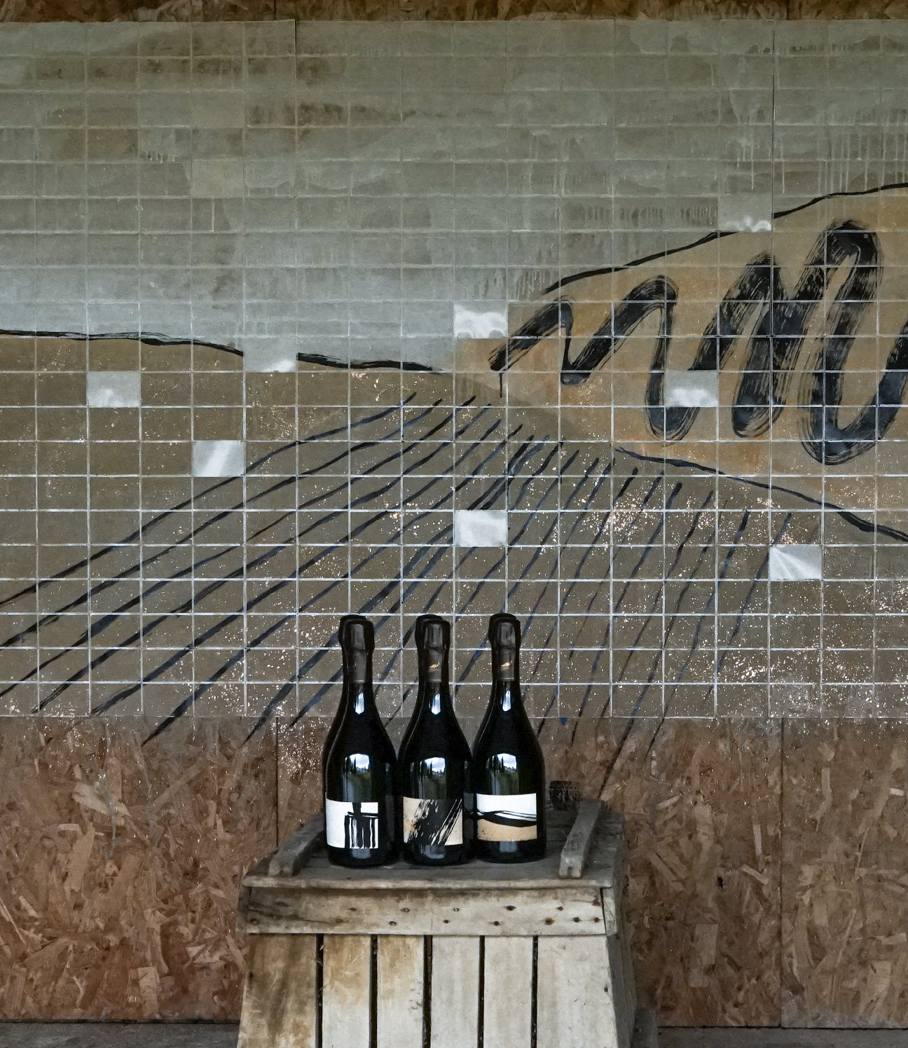
What started as two cuvées has since grown to a family of six. The original colour codes carried through across the range, and a layered background graphic was added to work alongside Bruno’s singular brand element of an angular, minimalist butterfly, giving the system more depth as it expanded.
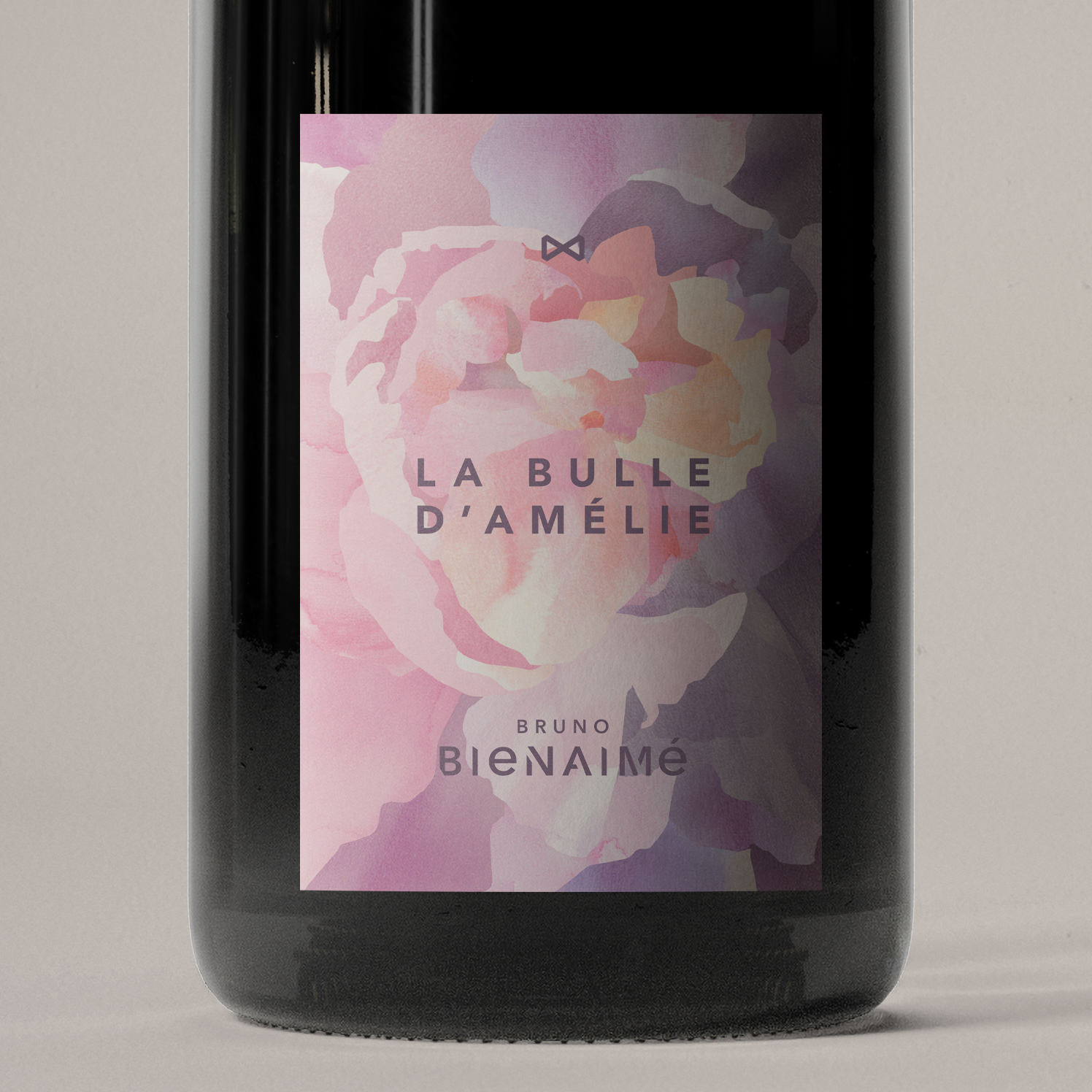
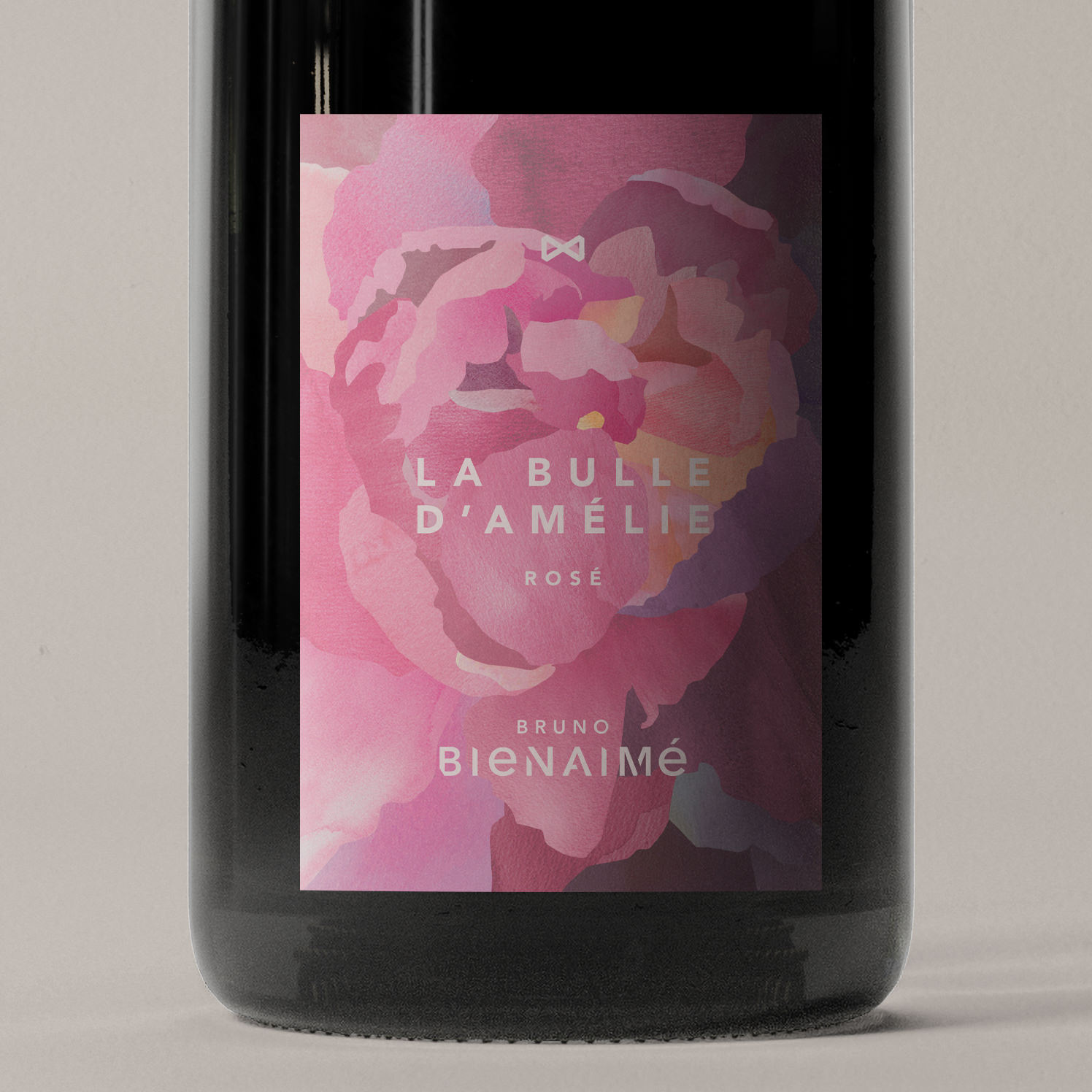
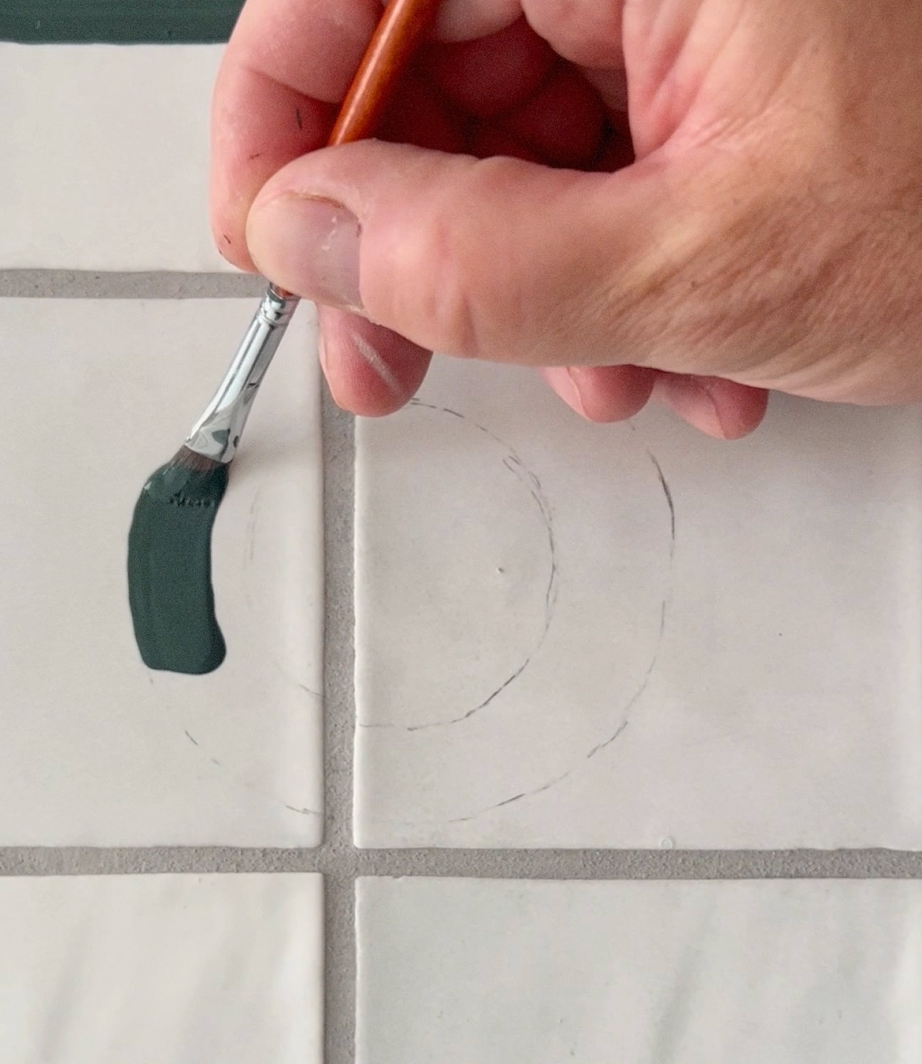
PEONIES FOR AMÉLIE
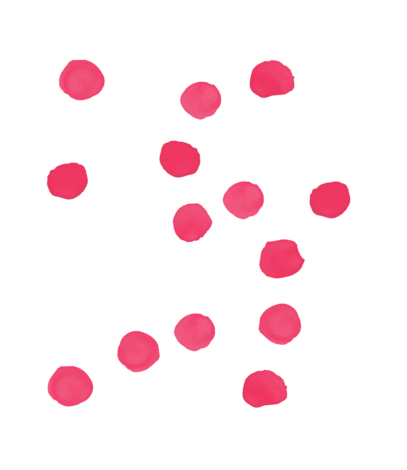
For his two sparkling Chardonnays, Bulle d’Amélie – one white, one rosé – the brief was deeply personal. Amélie, Bruno’s late wife, loved sparkling Chardonnay and these cuvées are dedicated to her. Her favourite flower was the peony, and Bruno wished for a white bloom and a pink one to grace the labels.
We painted the watercolours on large sheets of paper and scanned them. The peony shapes were made on the computer, and the painted material was cut and arranged inside them to compose each bloom. These etiquettes sit within the colour system, but stand alone in their expression. Which is exactly how it should be.
CREDITS
Designed and crafted by Formgiverne
CLIENT QUOTE

"I needed a fresh look and cuvée naming system, which Formgiverne created for me. I’m very pleased with the work we’ve accomplished together and look forward to what the future holds!"
– Bruno Bienaimé